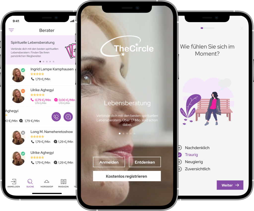
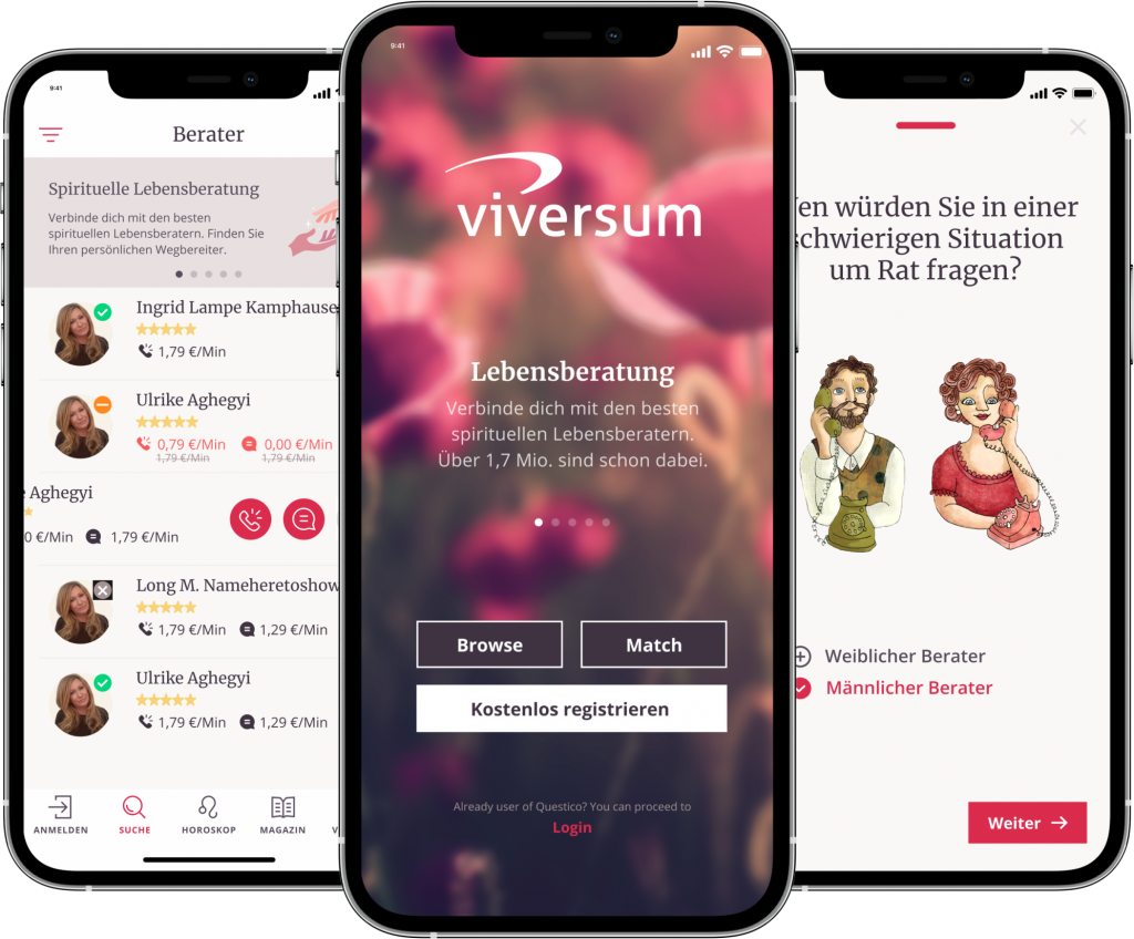
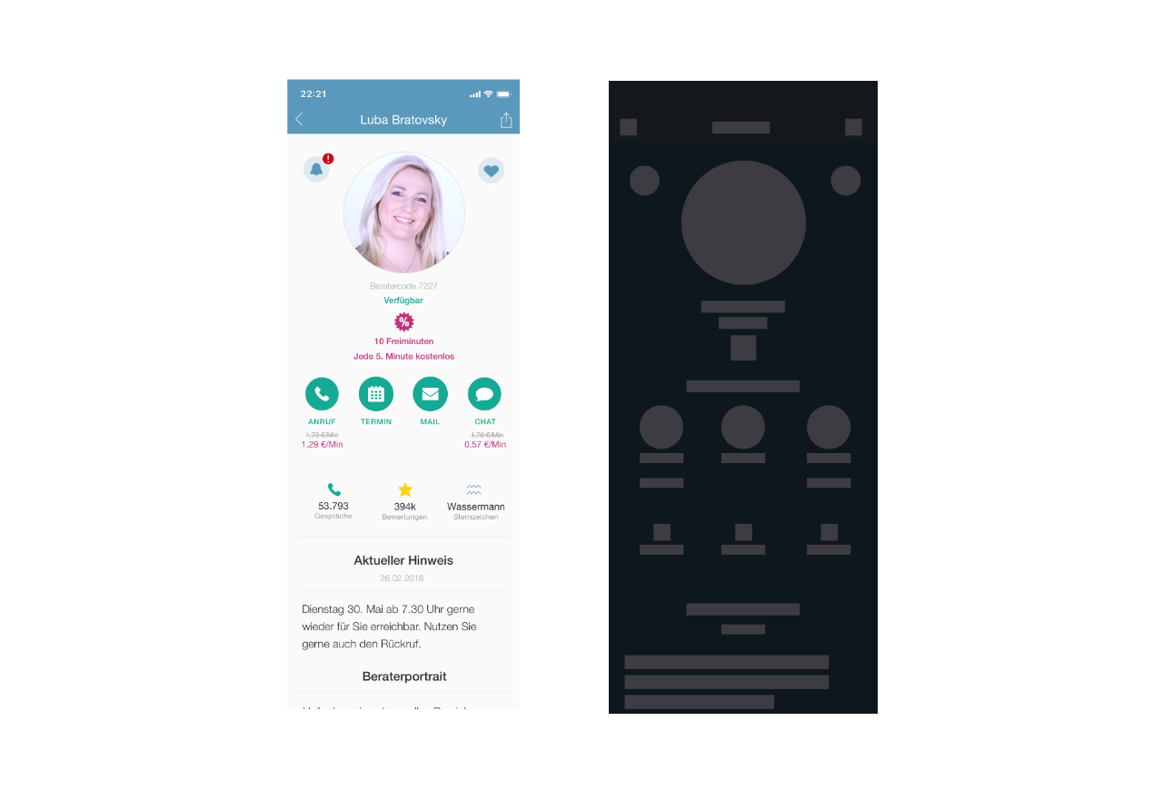
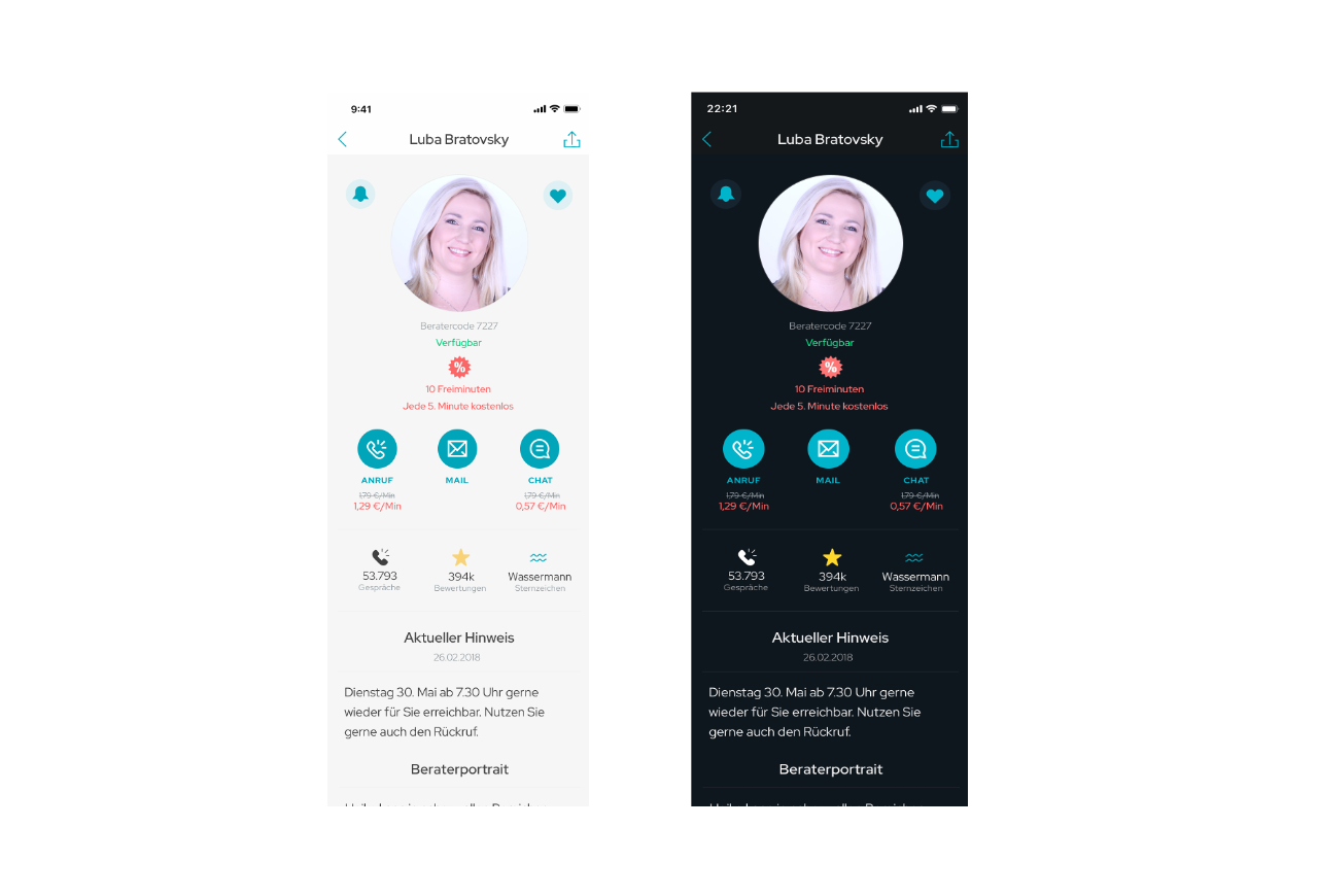
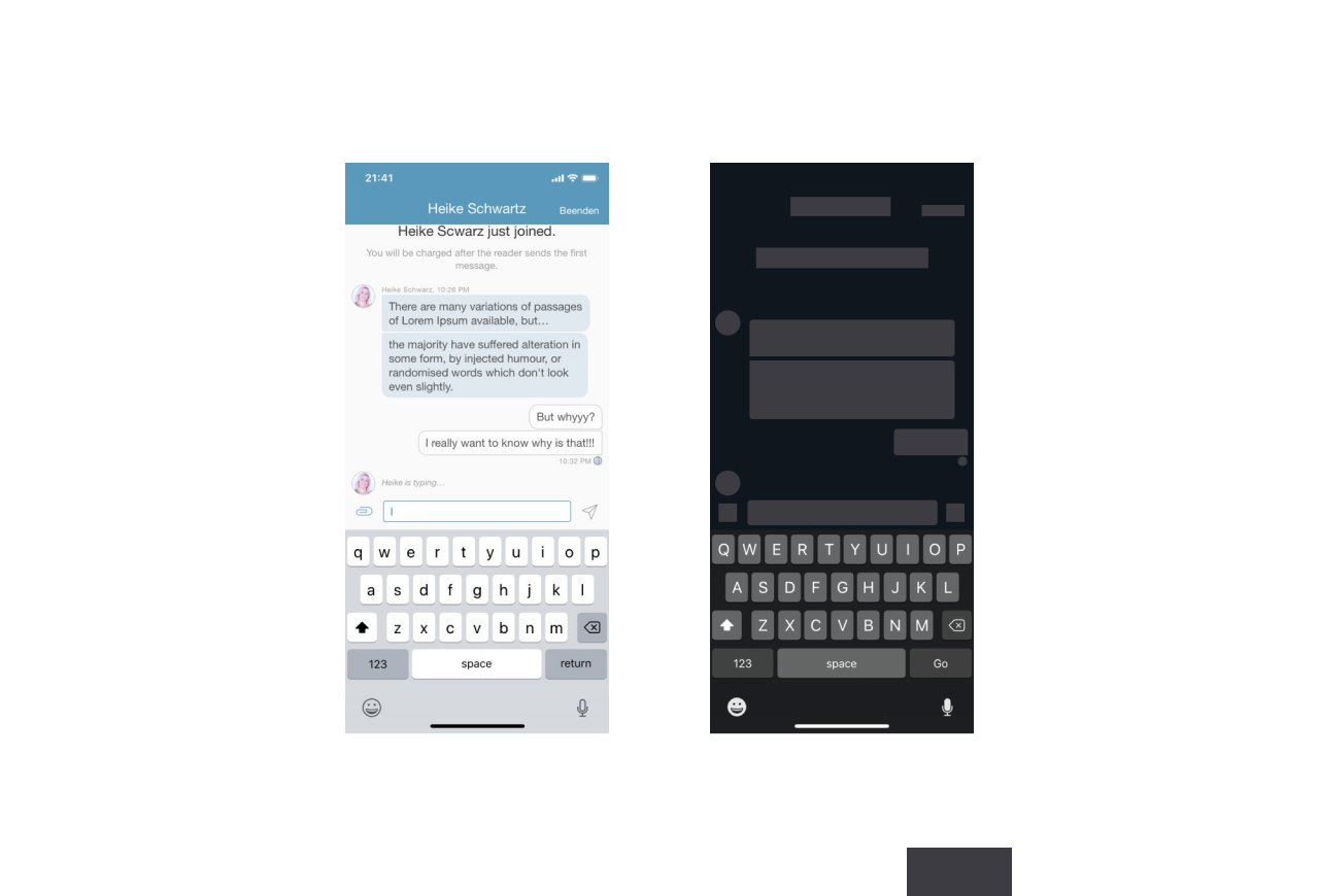
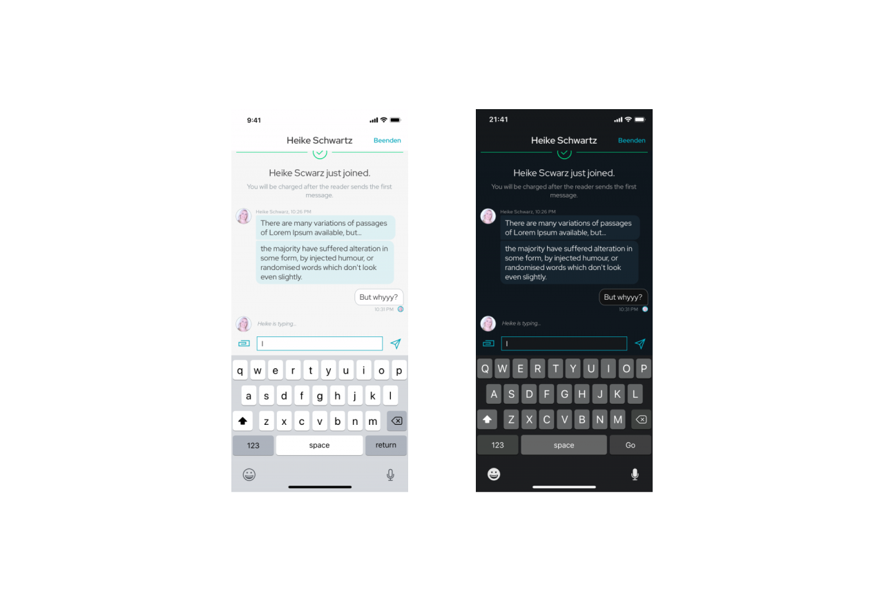
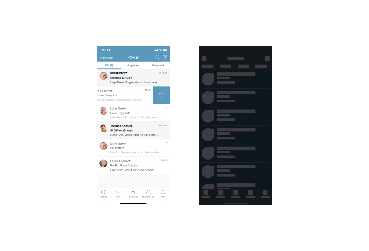
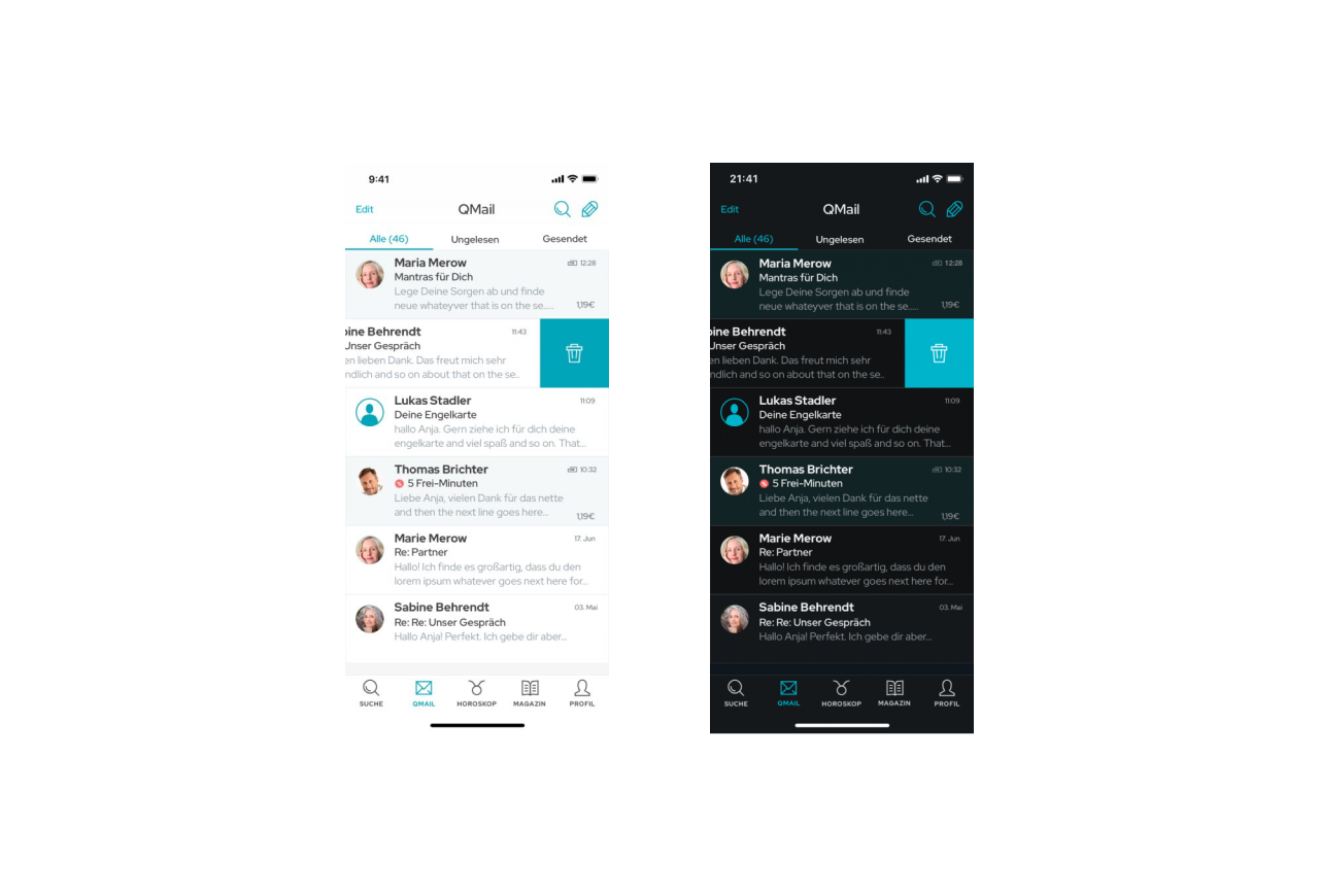
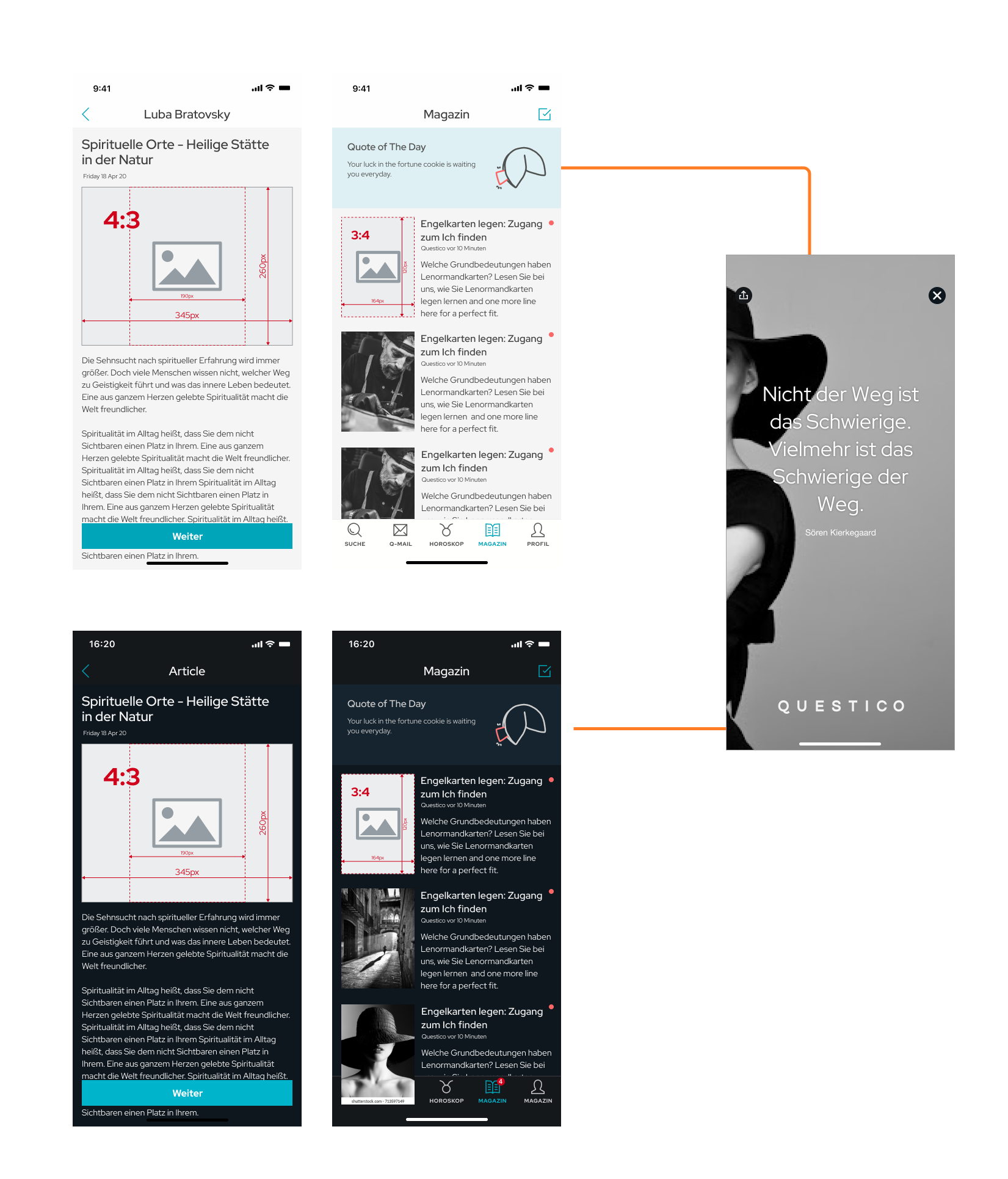
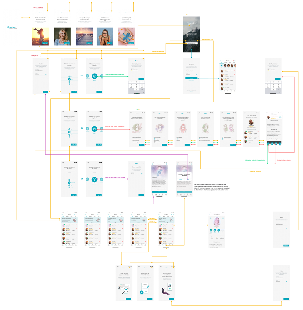
White Label
The brand team rebranded three white-label brands, and as part of the Mobile Team, I ensured these changes were consistently reflected across the apps. To support this, I established a strong design system that sped up implementation and simplified future maintenance. I also contributed to improving user acquisition by streamlining and personalizing the onboarding and registration flows, reducing friction and boosting completion rates.
Task
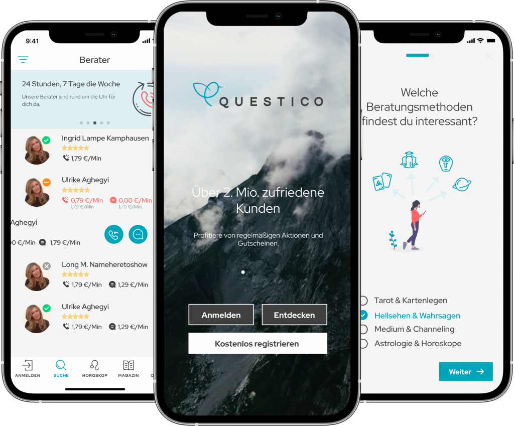
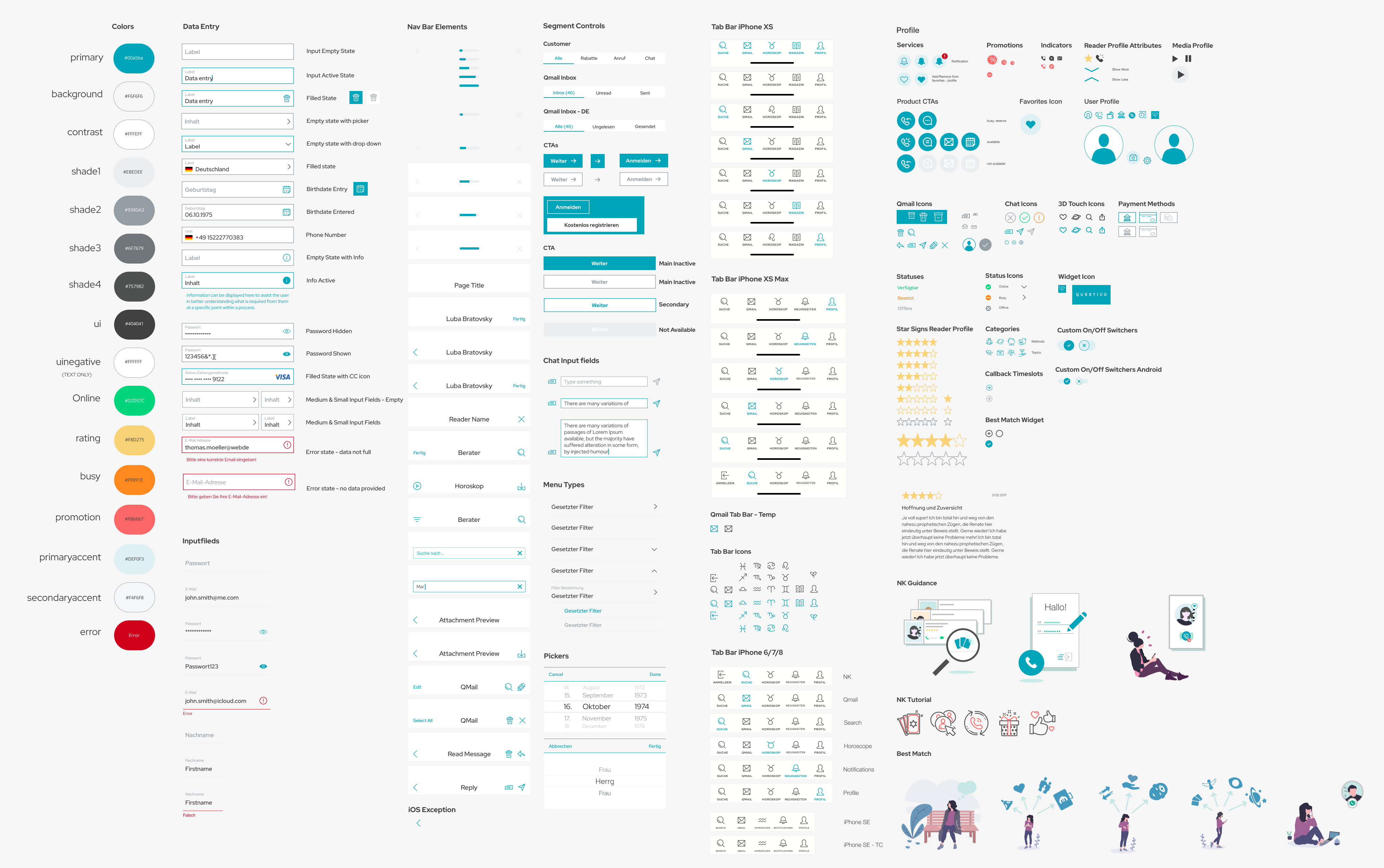
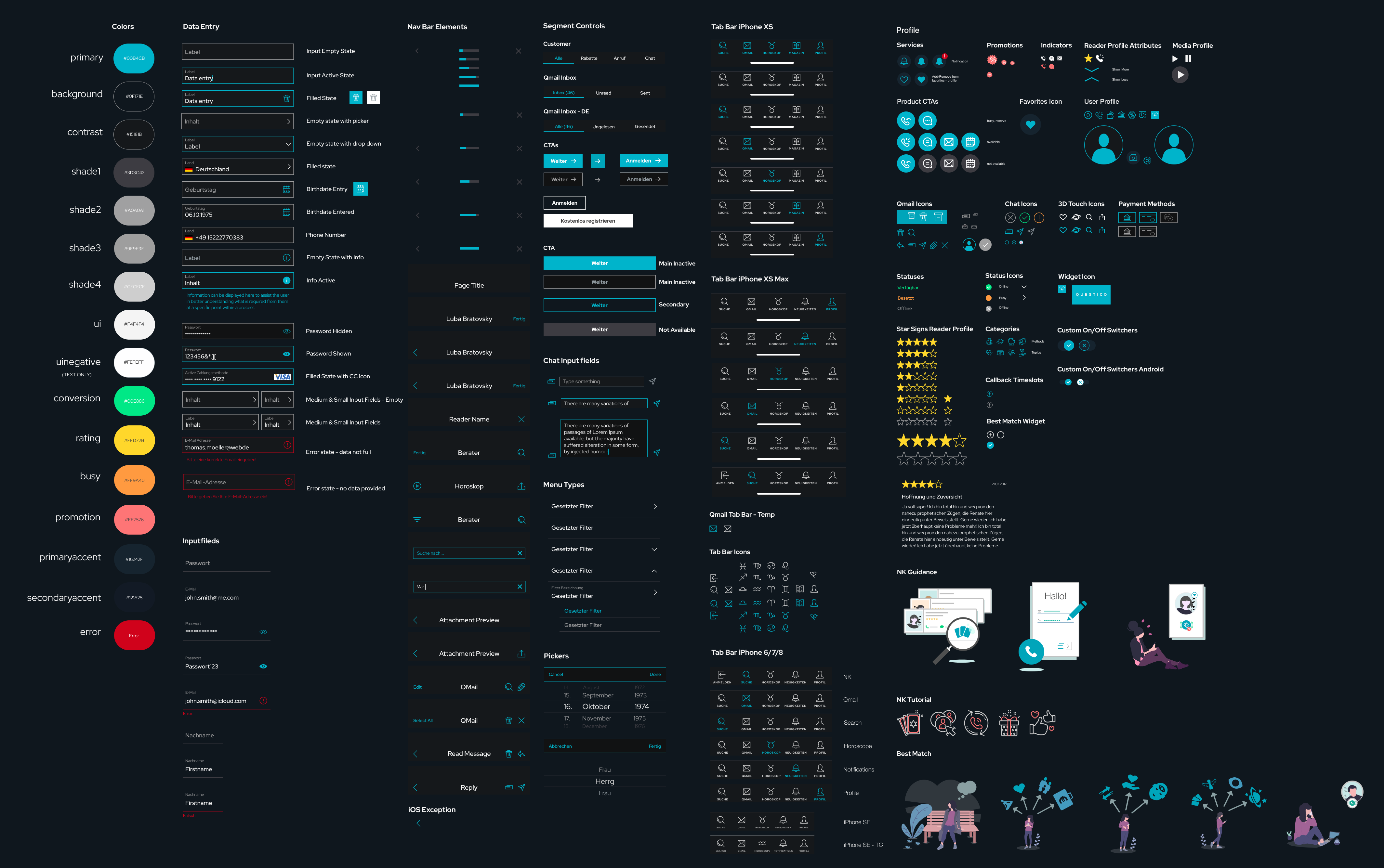
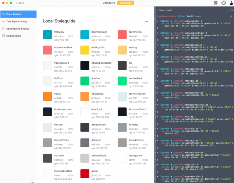
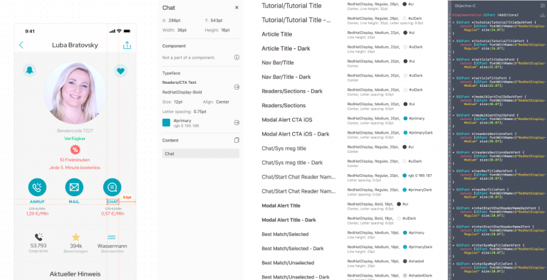
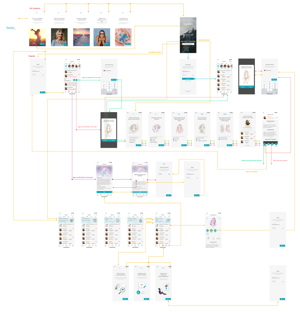
I was hands-on owning the design system for Questico and its white-label apps across multiple markets and platforms. The main goal was to keep the system flexible and consistent to support rebranding, UI improvements, and feature updates efficiently. The key challenge was balancing customization for different brands while maintaining a unified, scalable system that sped up design and development.
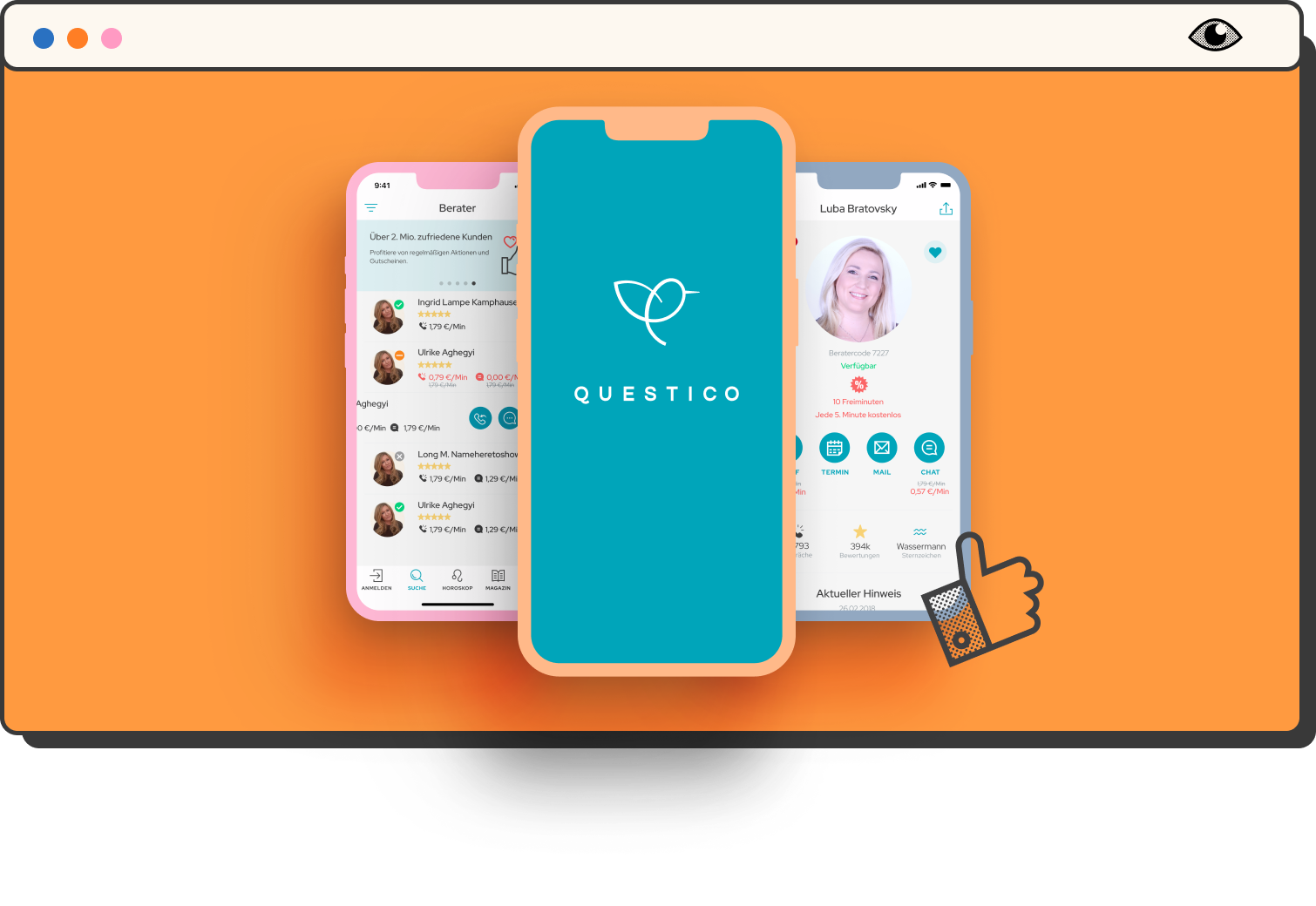

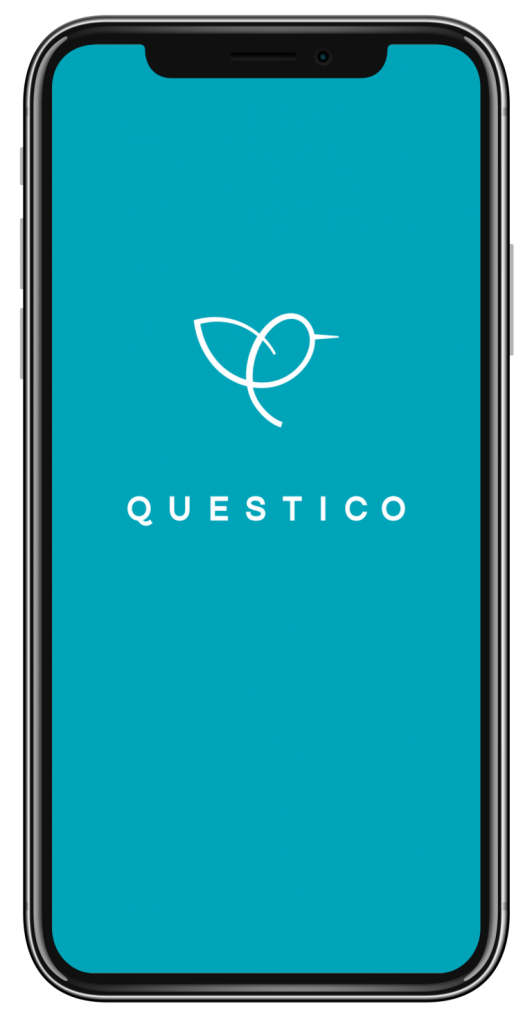

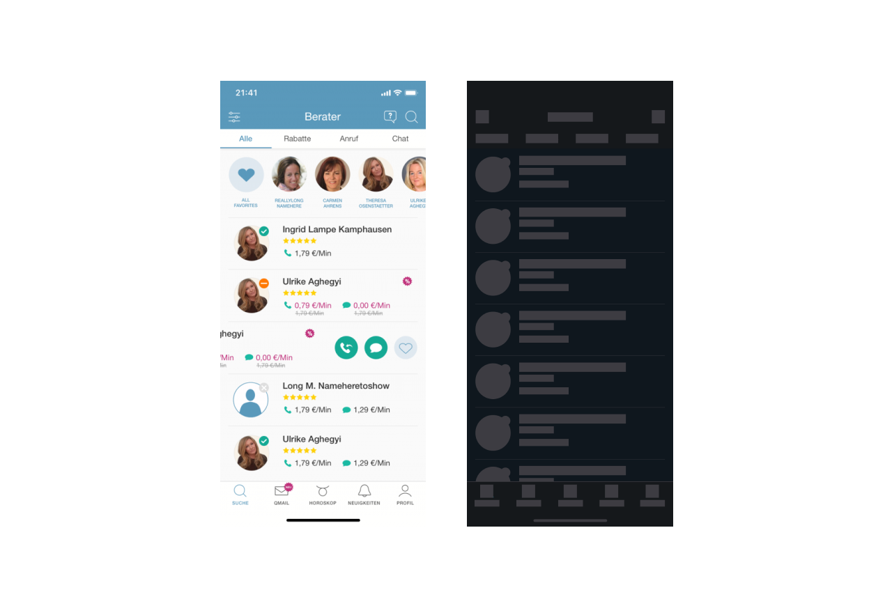
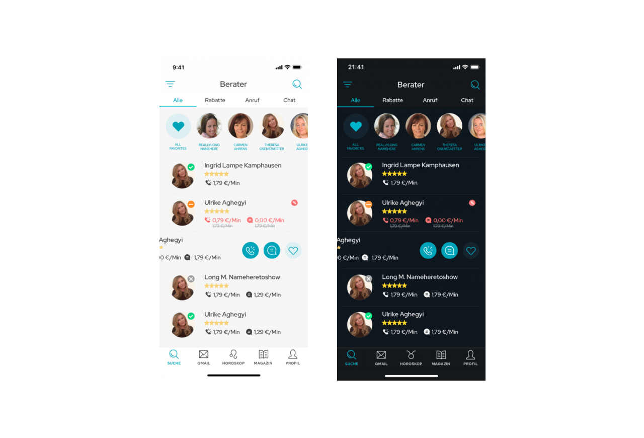
Questico iOS & Android
iOS & Android app
iOS & Android app