Redesigning 4m annual users marketplace
Redesign entirely the experience of the Seller/Supply users of a marketplace
Task
Cause of a complete Company Reorganisation & Strategic Realignment, we’ve had the opportunity to question and redefine the complete experience of the Supply users of a spiritual advice Marketplace.
-
Strategy
Enhance Supply Users
-
Design
Product Lead
-
Client
in-House
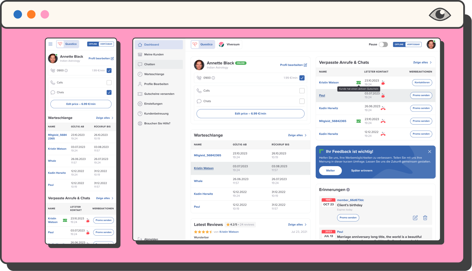
Introduction
adviqo Group connects people seeking spiritual guidance with experienced advisors, offering a life-coaching GPS. With 20+ years in the business, they ensure users across the US, Europe, and beyond receive a top-tier experience.
After a company reorganization and a shift in focus, they set out to improve the advisor experience on the supply side. The reason? Realising that our products are the Sellers of our Marketplace. Enabling them to be successful, we are improving our Customer experience.
Adviqo GmbH has been acquired by Ingenio, US-based category leader on May 2022.
In this case study, we’ll dive into the redesign process aimed specifically, at enhancing the advisor experience.
Lead Product Designer
I joined the project as Lead Product Designer, having been specifically transferred to the business unit to take ownership of that project and in general of the design work of this business unit. My recent experience leading a successful migration for a US/Latam marketplace proved valuable for this initiative, since the same backend would be used as the starting point.
-Led a Product Design team of 4.
-I worked closely with three Product Managers for the operational tasks.
-Work in a Product Trio with the Chapter Leads for both Backend and Frontend development for the big migration project.
Problem
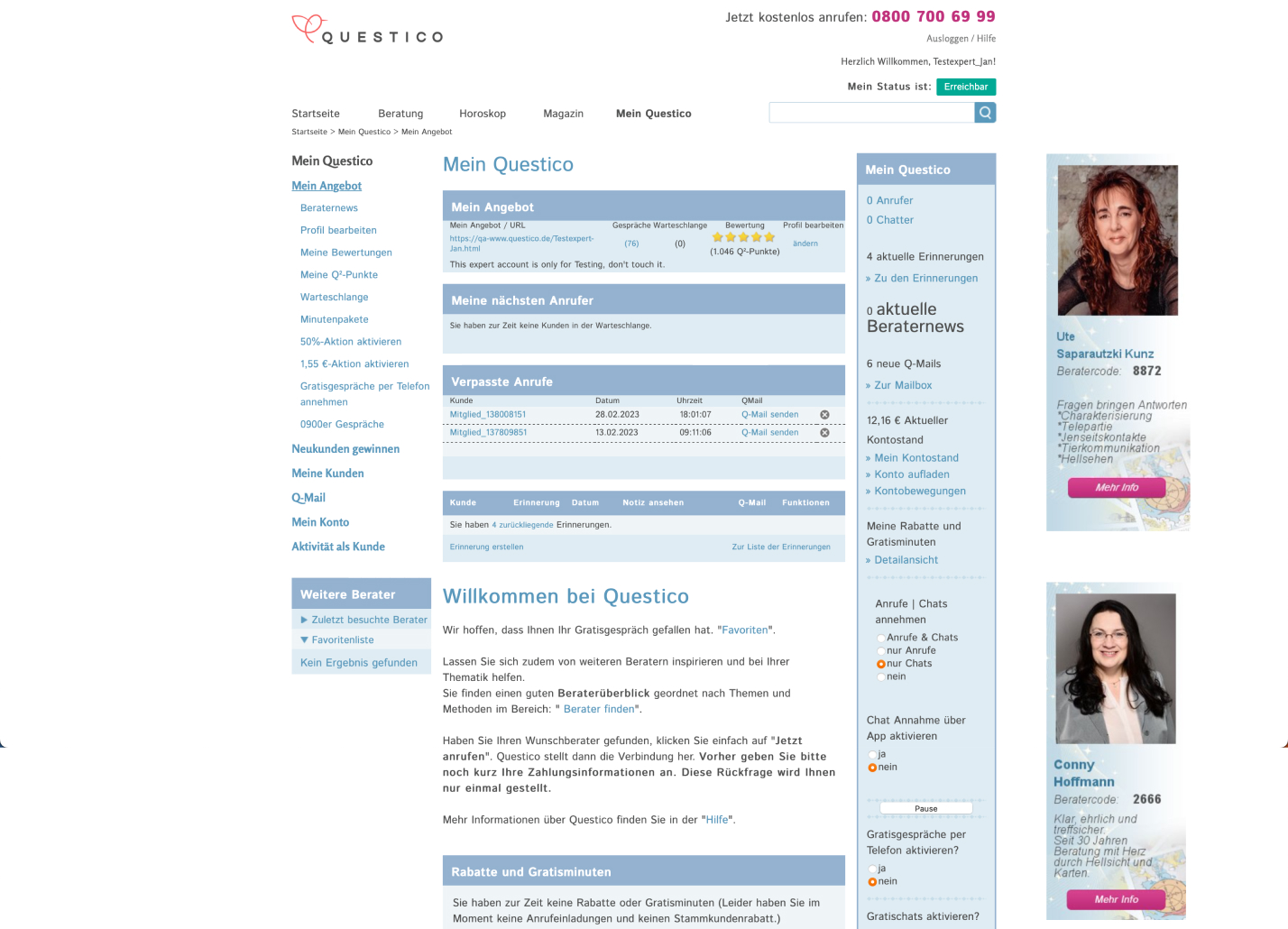
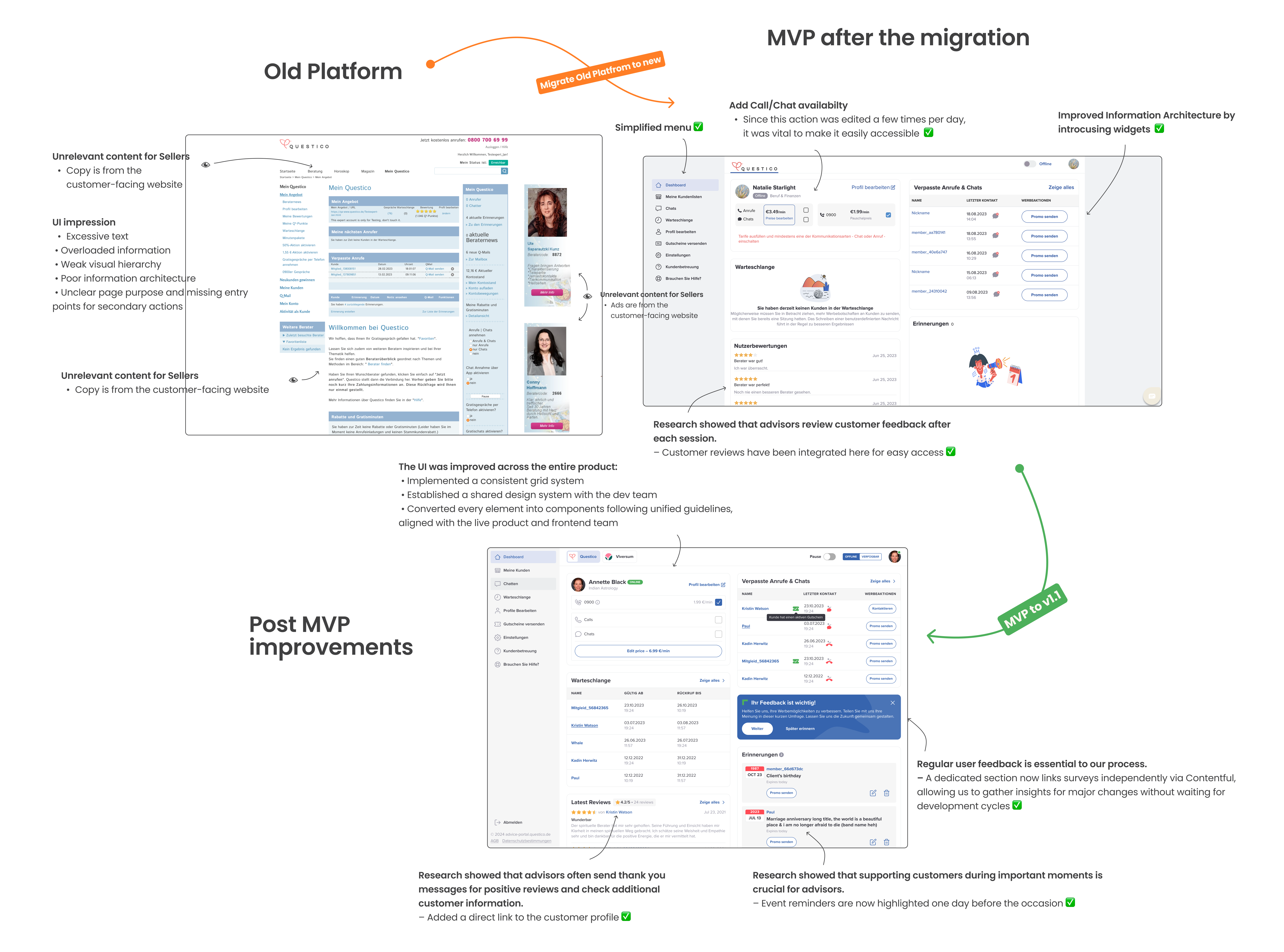
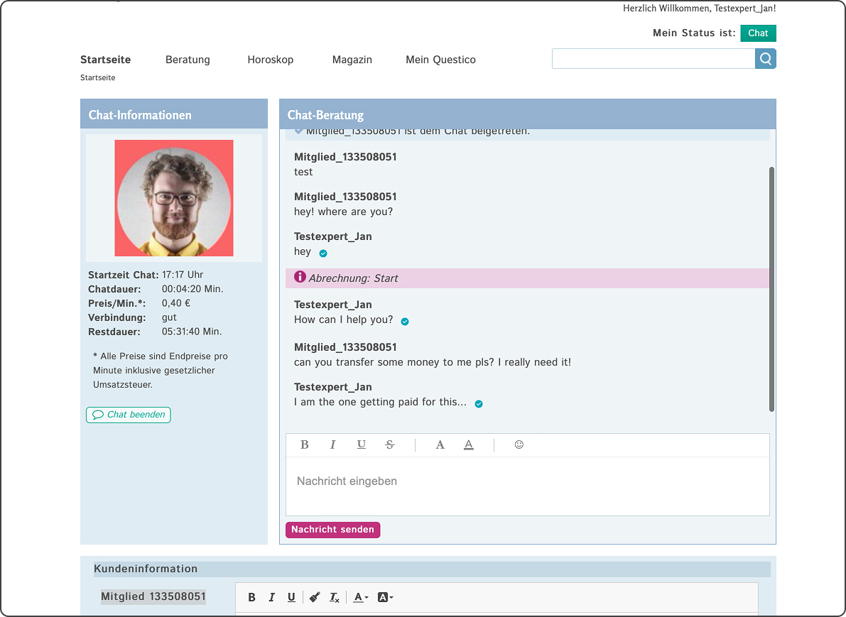
The platform’s tech, unchanged since 2003, faced major challenges: an inflexible backend and outdated HTML/CSS frontend blocking progress. With a full tech overhaul underway, it was the perfect chance to redesign the site and tackle key issues, which are detailed below.
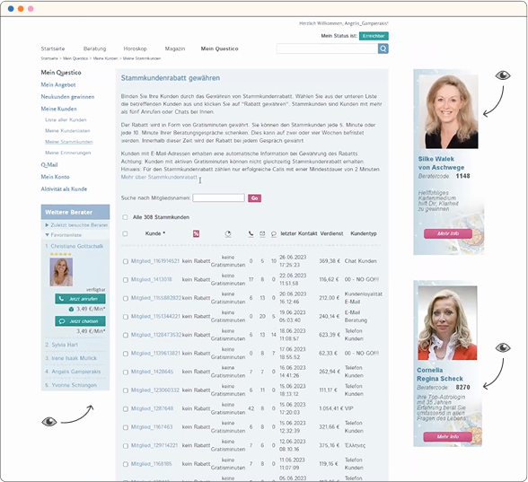
No Relevancy
Without a clear structure, the platform’s interface was a maze. Poor visual hierarchy mixed critical advisor workflows with customer-facing content, creating a chaotic experience. High-value features were buried under clutter, slowing workflows and testing patience.
No separation between advisor and customer content meant irrelevant information everywhere.
• Too much text and scattered design made focusing nearly impossible.
• High-priority tools were hidden, requiring advisors to hunt for them.
Advisors, unable to streamline their workflows, spent more time researching competitors instead of focusing on improving their processes and serving their customers effectively.
No Defined User Journey
The platform lacked defined user flows, turning every interaction into guesswork. Navigation was messy, with multiple disconnected entry points. The interface presented a steep learning curve, overwhelming users with all options at once, without progressive disclosure to ease them in.
A cluttered interface with no clear task paths made even simple actions feel daunting.
• Users stumbled into flows unintentionally, creating confusion and inefficiency.
• Without onboarding guidance, new users faced a mountain of effort just to get started.
The steep learning curve and undefined journeys led to frustration and wasted time, leaving users struggling to complete tasks and diminishing overall productivity.

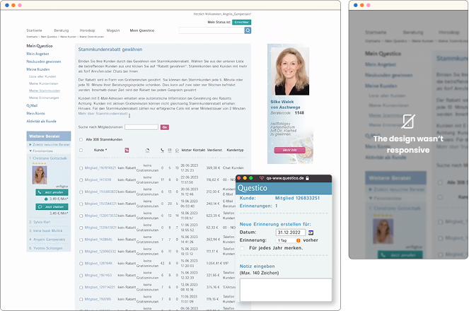
Outdated Tech
The website’s design and performance were stuck in the ’90s, leading to major trust issues and a dated experience. Manual processes overwhelmed customer support, and there was zero mobile compatibility. The backend and frontend lacked flexibility, causing constant friction and internal inefficiencies. Inconsistent design components created a patchwork interface—when one broke, the entire site could crash.
Advisors had to manage billing and queues manually.
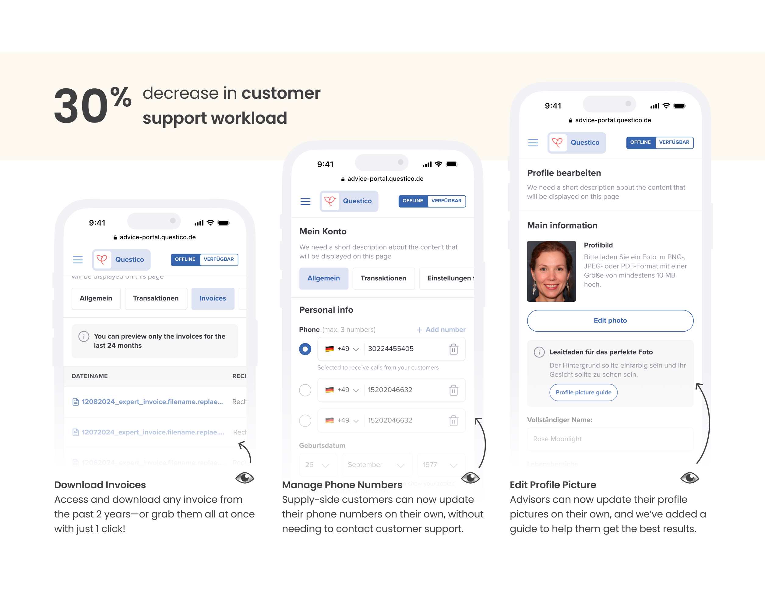
• Common tasks like profile edits or registrations required CS intervention.
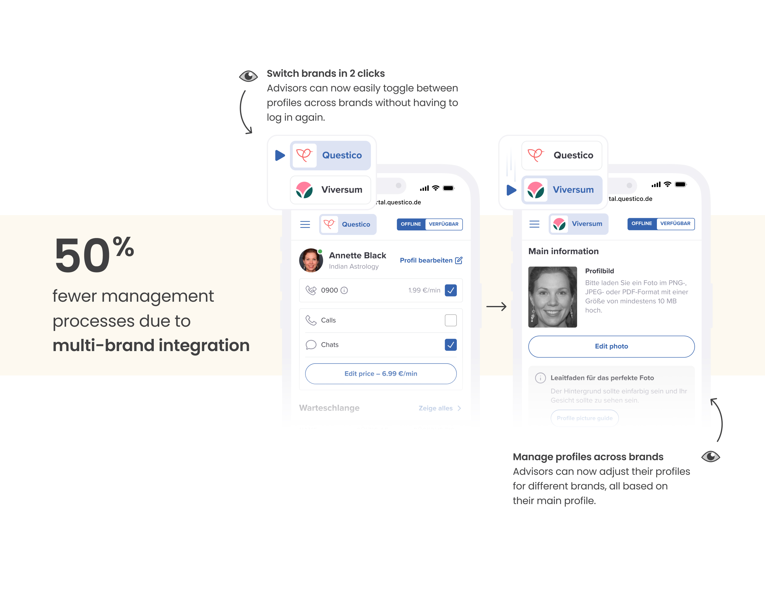
• Maintaining two websites (Viv and QDE) meant duplicating effort for everything.
Without a unified, scalable design system and consistent UI, the platform remained fragile and inefficient, wasting time patching outdated solutions instead of delivering value.
Defining the problem
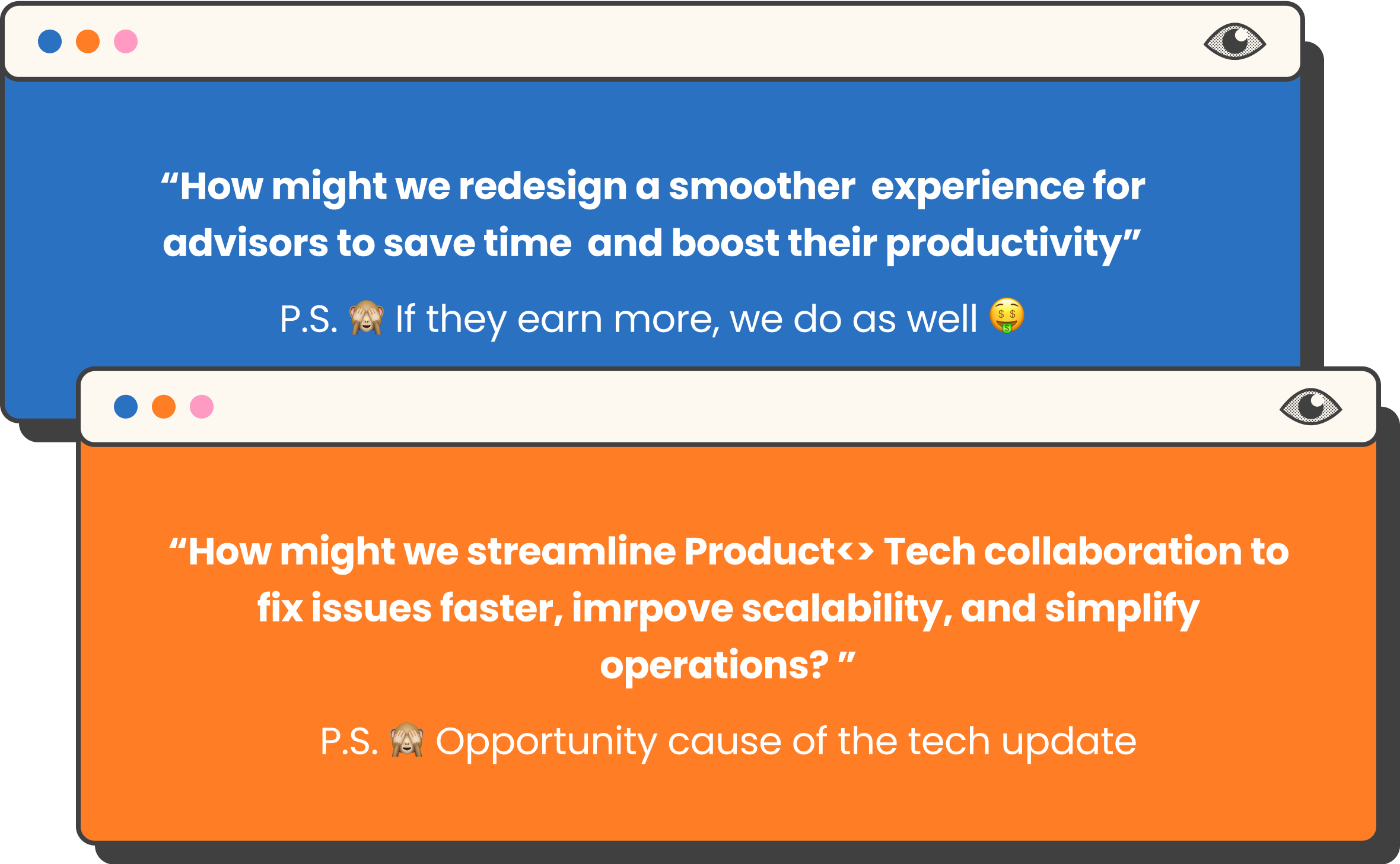
Approach

Business Goals
Increase Trust with Advisors (Supply-side users)
By shifting focus from customers to advisors, we aim to improve product quality, a key area we’ve overlooked for the past 20 years.
“The supply knows our customers better, let’s enable them to make the most of it.”
Operational Efficiency
By shifting focus from customers to advisors, we aim to improve product quality, a key area we’ve overlooked for the past 20 years.
“The supply knows our customers better, let’s enable them to make the most of it.”
Eliminate Manual Processes
By shifting focus from customers to advisors, we aim to improve product quality, a key area we’ve overlooked for the past 20 years.
“The supply knows our customers better, let’s enable them to make the most of it.”
Users Goals
Increase Transparency & Awareness
- Lack of transparency has impacted trust with advisors. We aim to demonstrate the value we bring to foster better partnerships.
- Increased awareness and metrics’ transparency can shift their focus where it will affect their performance, therefore their income
Increase Productivity & CRM capabilities
• Improve advisors’ daily workflows, decrease pain points so they can spend less time on repetitive tasks and more time delivering valuable services to clients.
• We’ll provide performance tracking to help them monitor and enhance their productivity and CRM features to enable Sellers doing the CRM for us 🤓
A delightful, consistent user experience
To ensure a proper design system is in place to reduce technical debt and give our users a better, consistent, responsive, and intuitive experience.
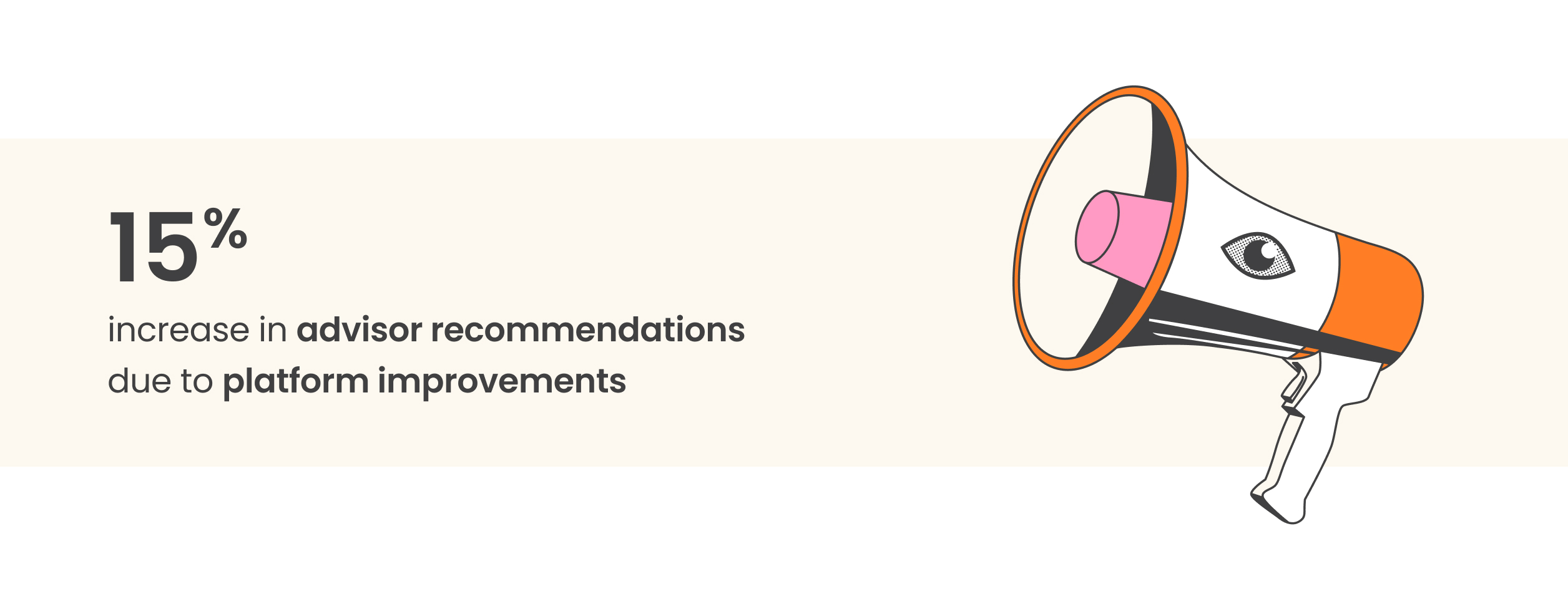
Impact 🎯
As this was a large-scale project, we rolled out the new designs in phases to quickly validate some of our hypotheses with the MVP.
For confidentiality reasons, I have omitted the specific values for these metrics.
Our Users
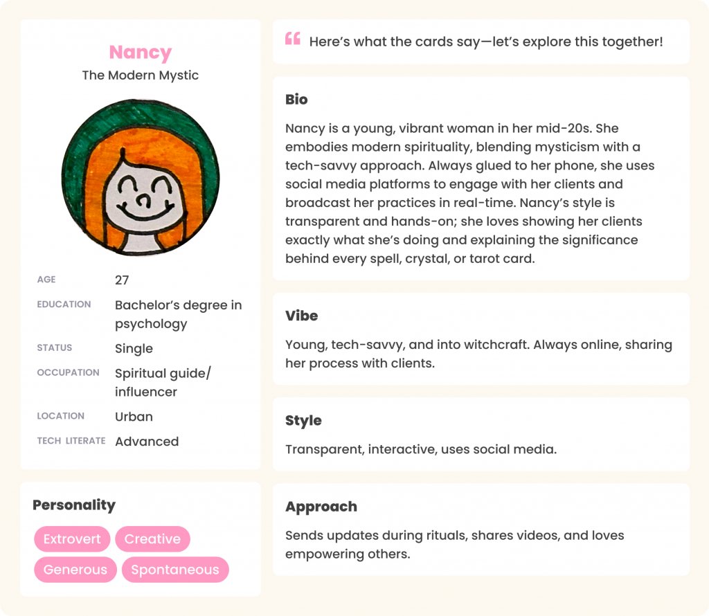
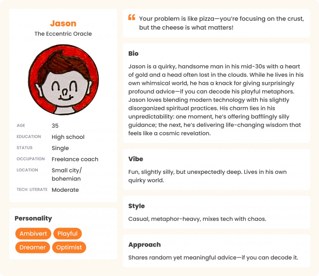
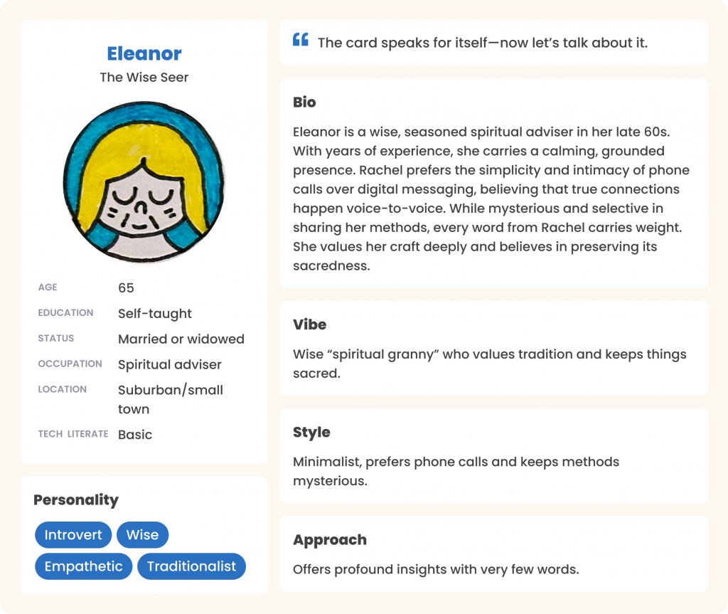
To make sure our MVP truly met our users’ needs, we started with some quick but meaningful research.
- We also dove into marketing surveys already in hand, searching for patterns and recurring themes from a product standpoint. This gave us a head start in spotting what mattered most.
By combining real conversations with data, we were able to validate our ideas, better understand user expectations, and shape our priorities for the MVP launch.
Process
My Role
Prioritized Back-End Migration:
Reused Front-End Components:
Limited Front-End Team Involvement:
Deferred Research to Phase 2:
Scoped Through Gap Analysis:
Release MVP & Training
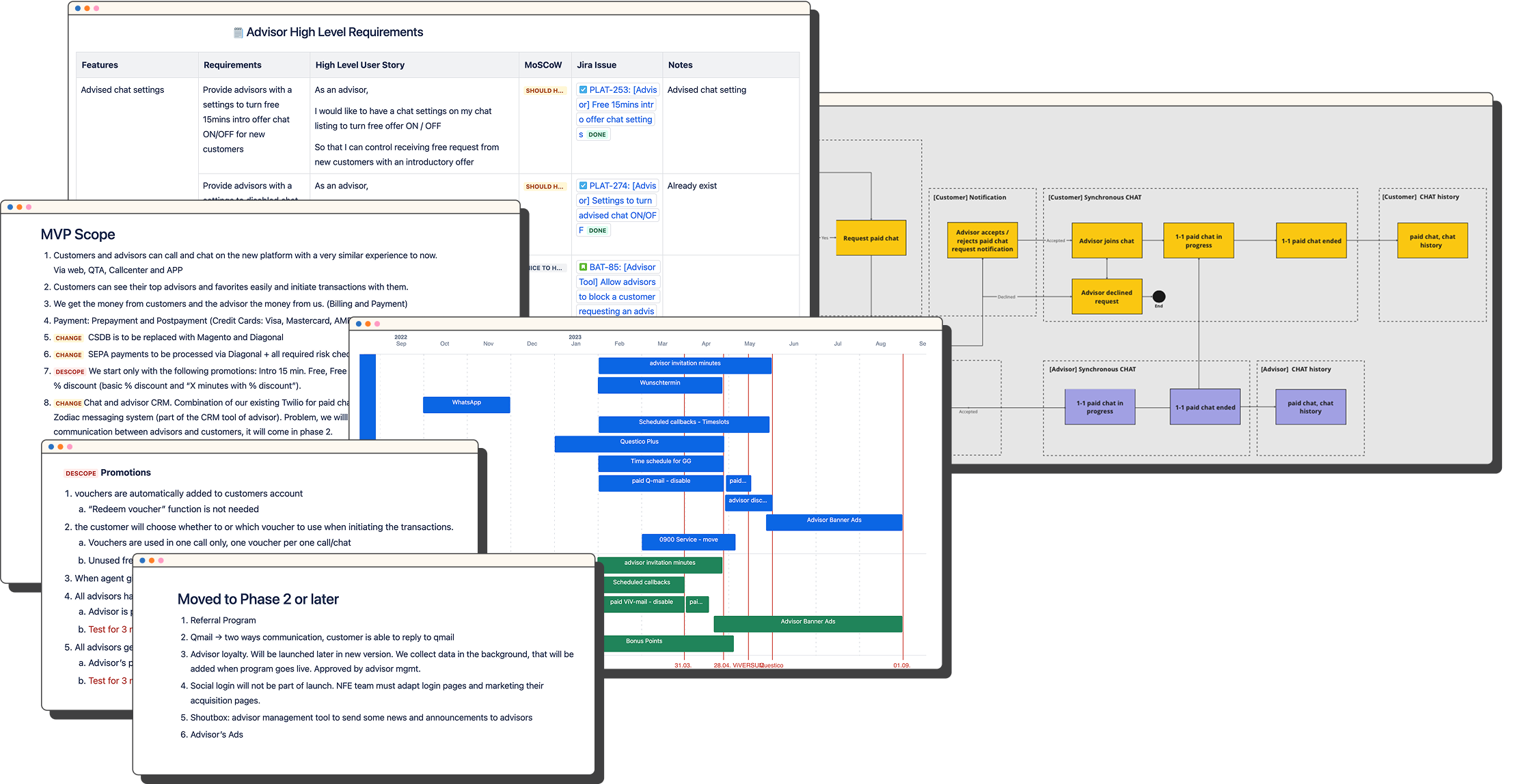
USA to DACH market platform migration
Zero research is too risky
Seamless integration vs. downscoping 🙃
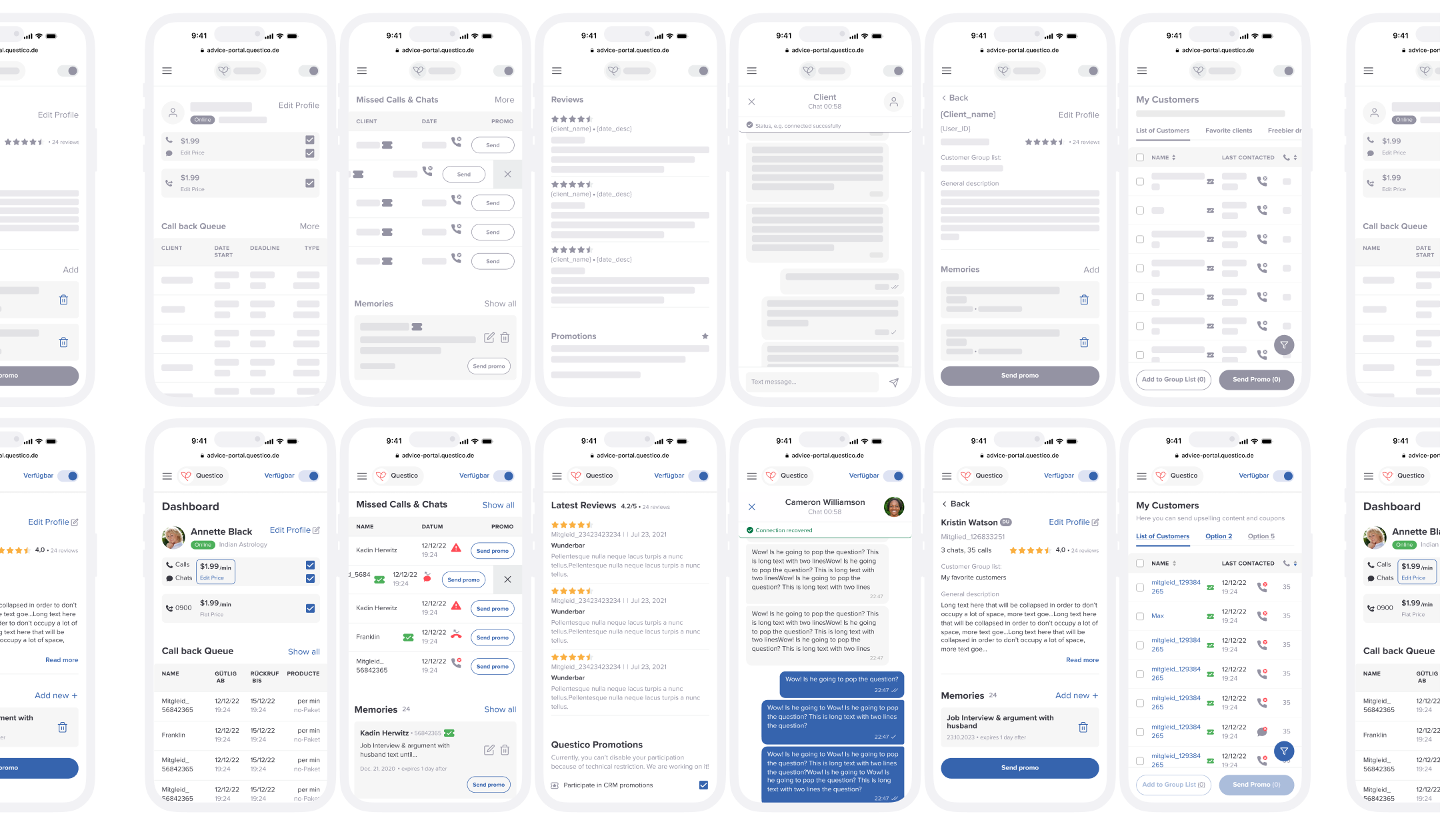
Early Designs
Research Objectives
Collect User Feedback
Uncover Pain Points
Validate New Features
Set Priorities
Research Methods
Surveys
We gathered insights from 184 supply-side users to identify key trends and pain points.

Interviews
Spoke with 5 advisors of varying demographics and popularity to gain diverse insights.

User observations
Visited two advisors to observe daily routines and real-world use of the new design.
Research Insights
Reduced Cognitive Load

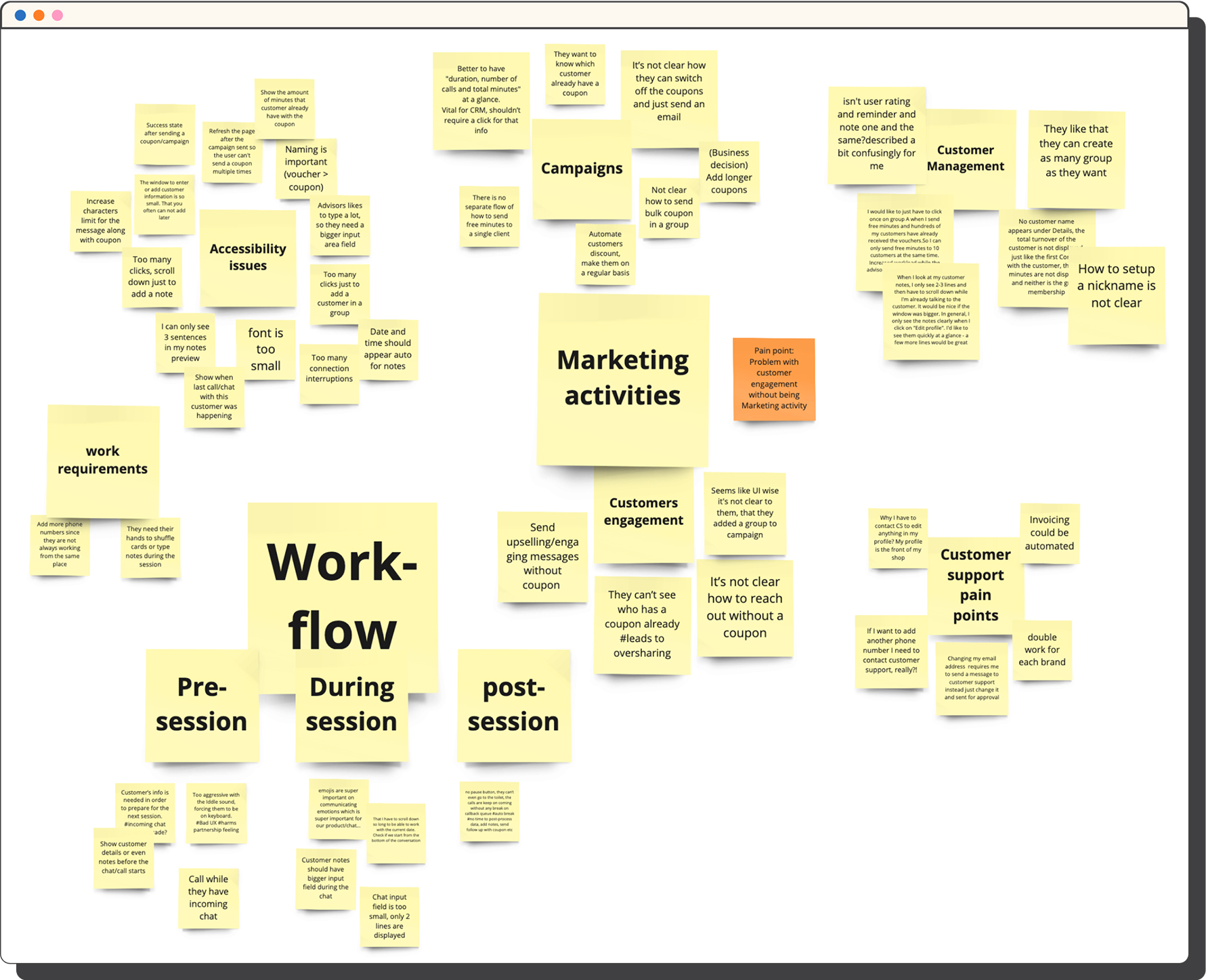
Accessibility Barriers
Task & Challenges
Affordance & Navigation
Design Successes
Process Flexibility
Quantitative Research Insights
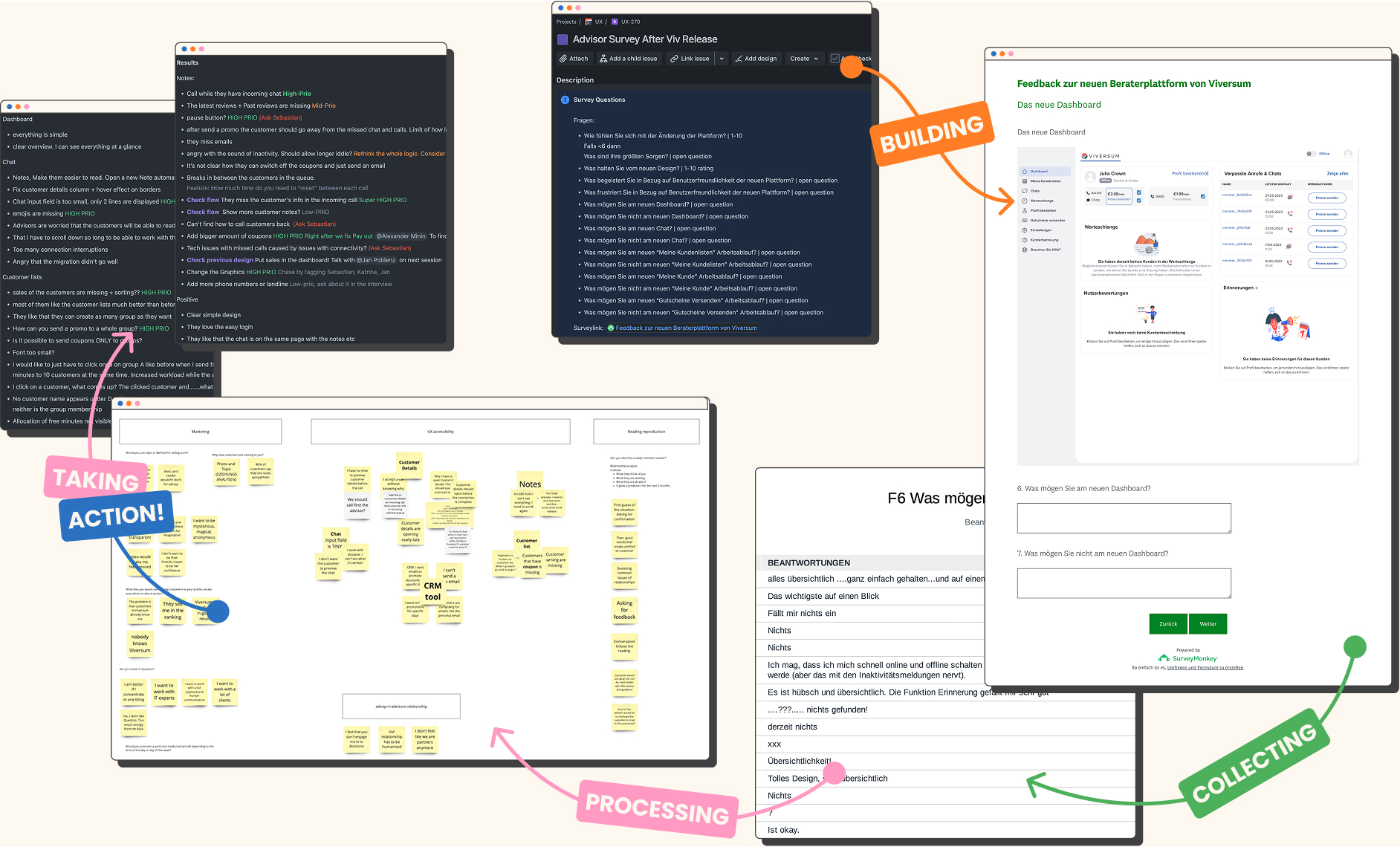
Quick Actions
CS Tickets were decreased by 30% 🚀
0%Dive Deeper
Daily Routines
Marketing Activities
Cross Team Workshop
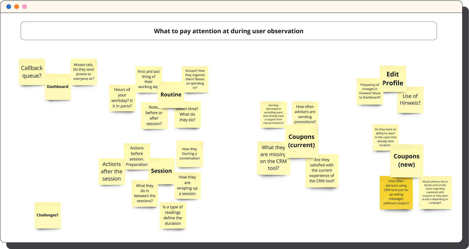
Qualitative Research
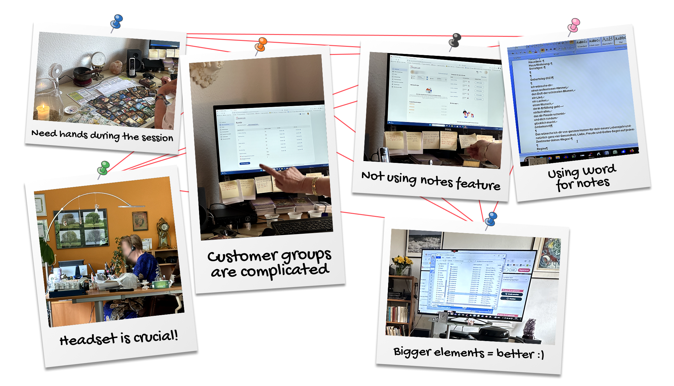
Key Qualitative Research Insights
Mapping the User Journey
Flexibility Matters
Feature Gaps and Prioritization
Bug Tracking and Resolution
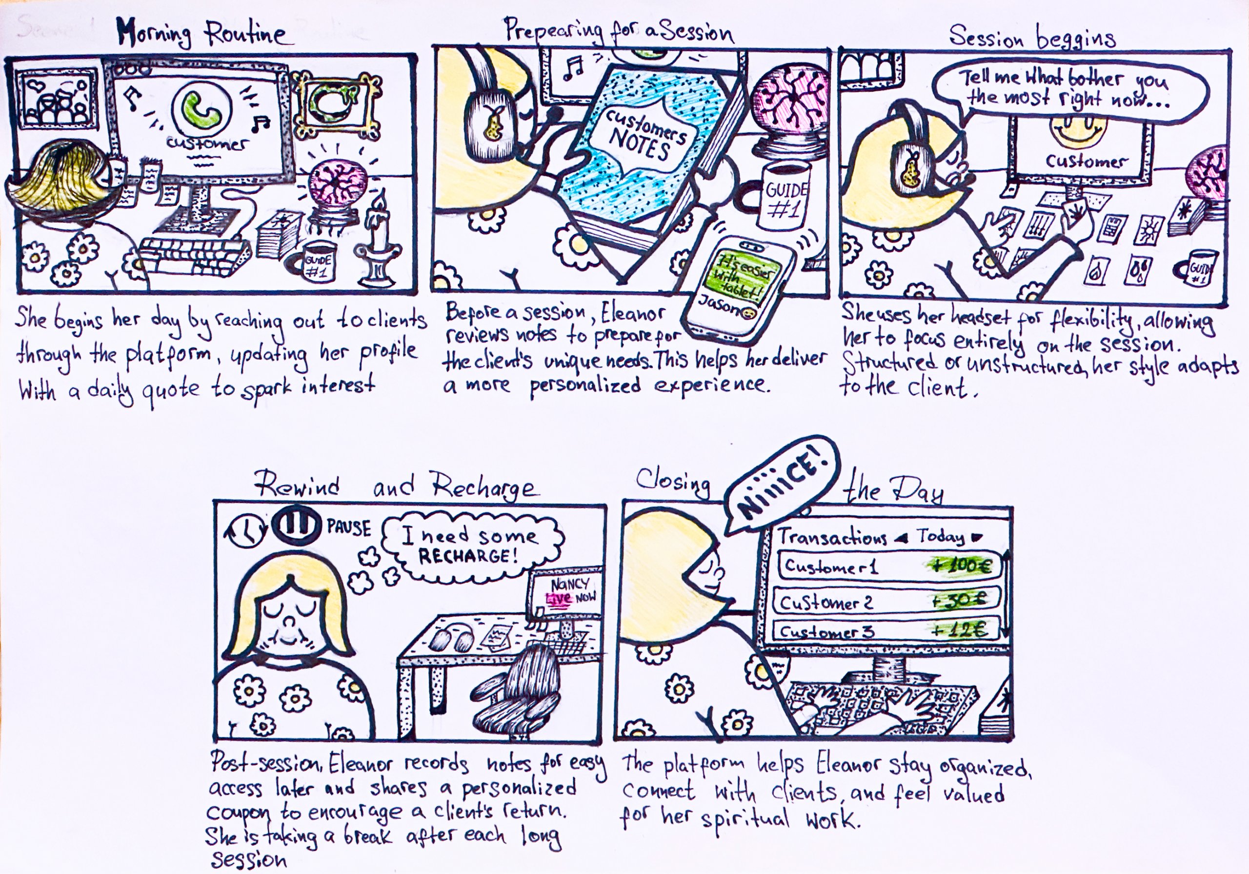
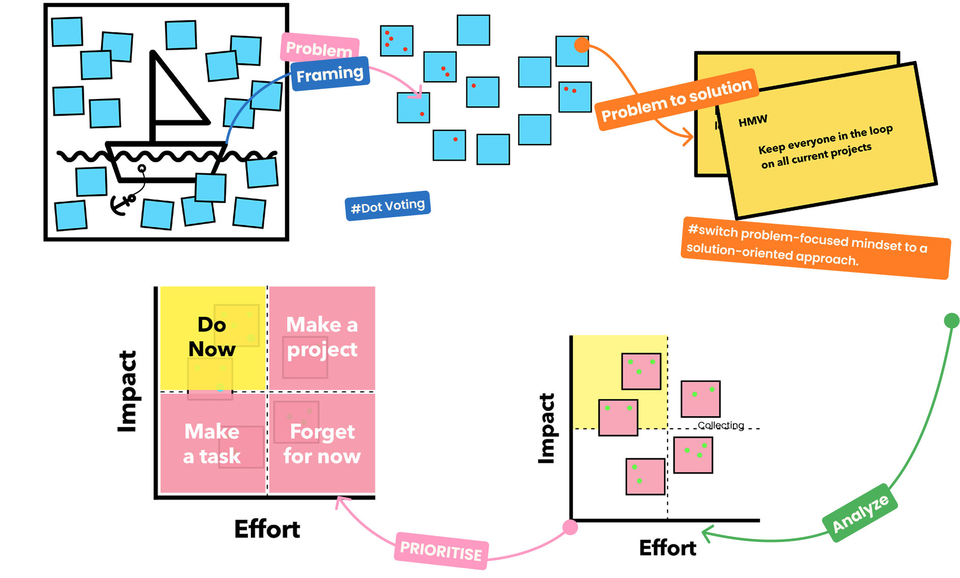
Updated The Way We Work
Introduced New Product Rituals
- Identify and report problems
- Gather and organize insights
- Brainstorm, prioritize and validate insights
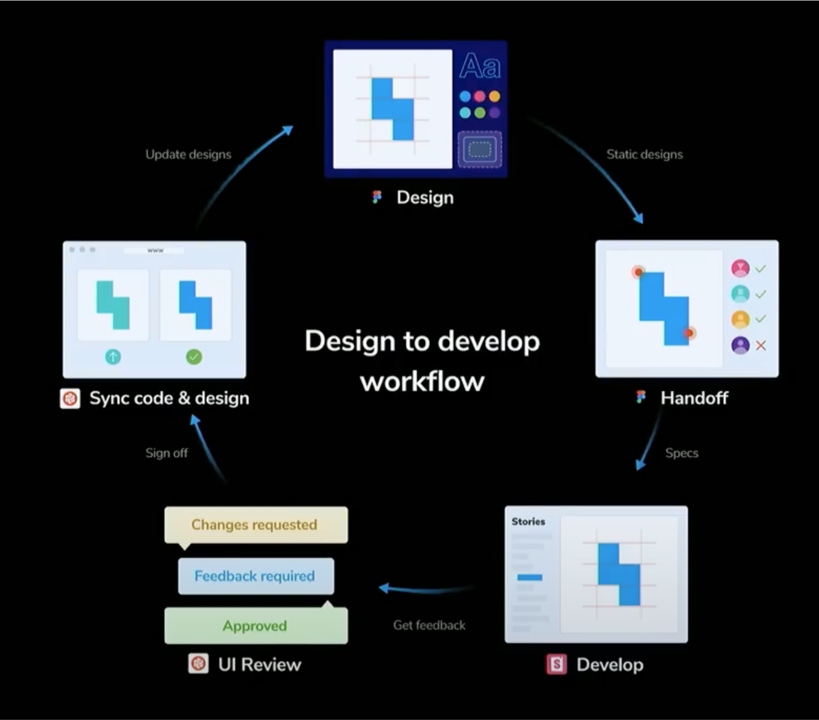
New Product<>Tech Delivery Process
I introduced a new workflow inspired by leading design handoff practices, connecting Figma, Storybook, and Chromatic. This streamlined collaboration, enabled side-by-side review of coded and design UI, and reduced friction between teams.
- Faster, clearer feedback between designers and developers.
- Shared component library for consistent UI across products.
- Automated visual tests to instantly spot unintended changes.
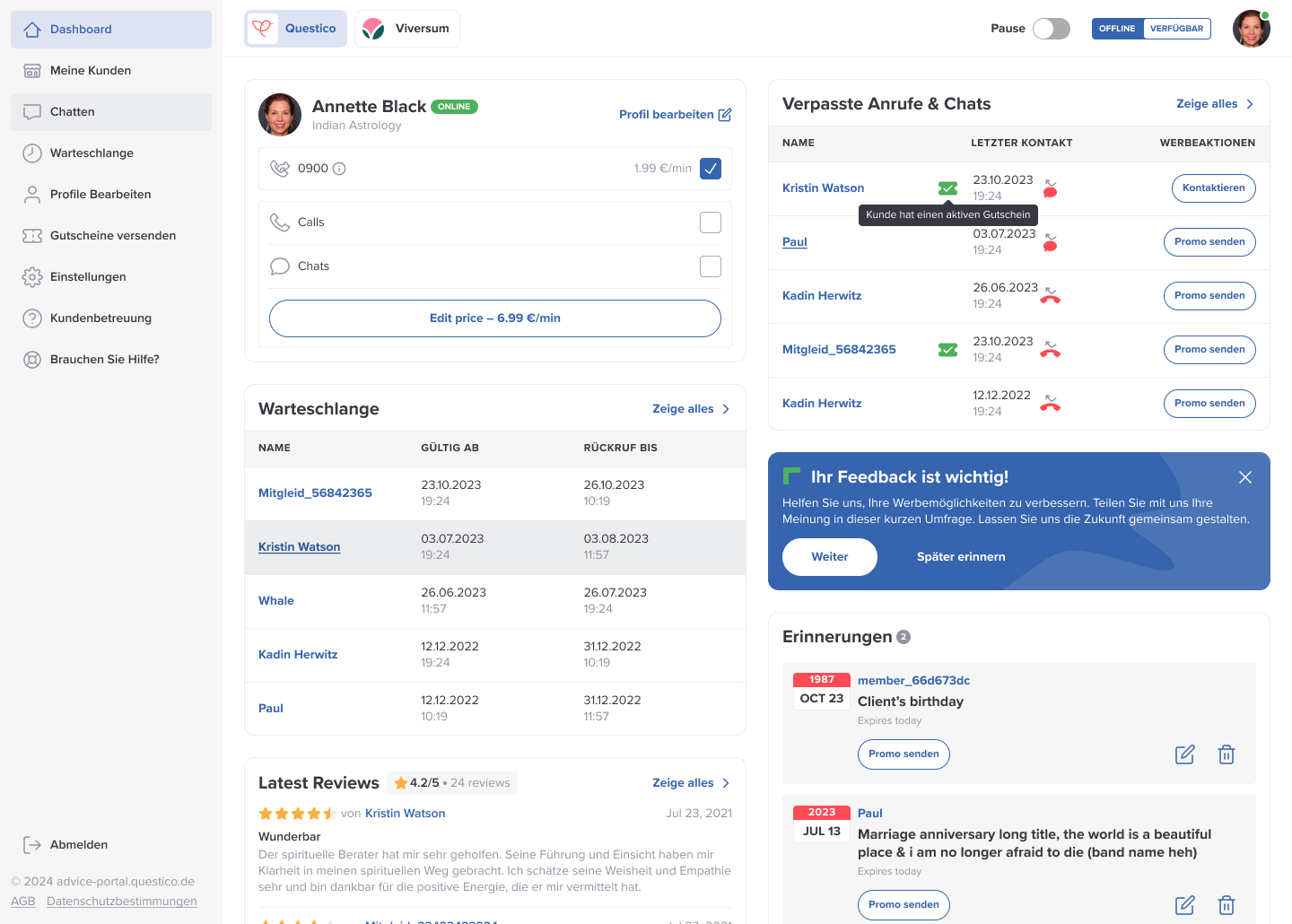
Final Designs
Dashboard Improvements for Seller User Experience
- Clearer navigation to main workflows
- Faster access to frequent tasks
- Enhanced usability through focused grouping
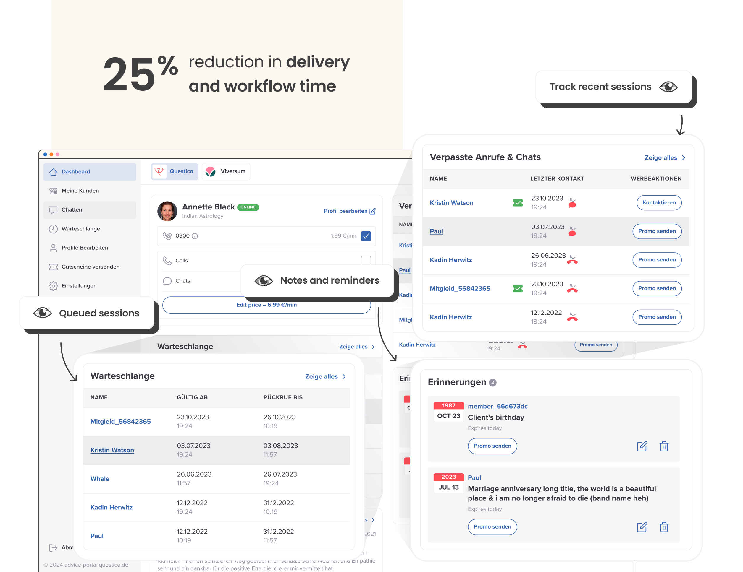
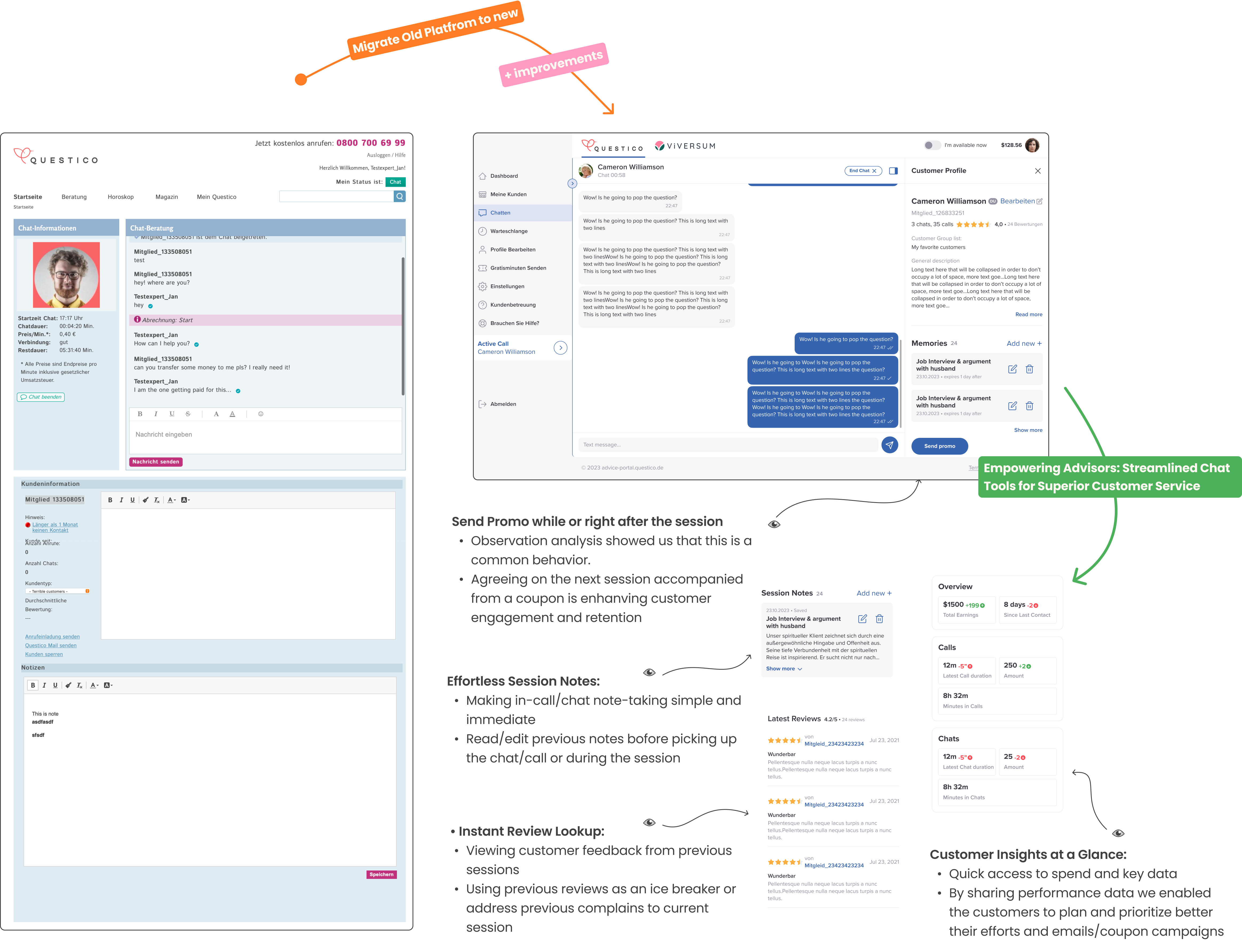
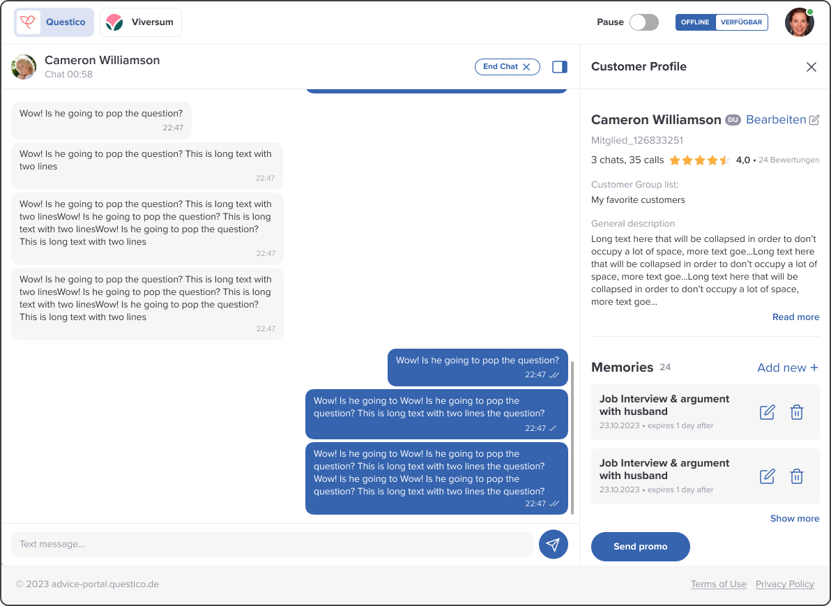
Chat Enhancements for Advisor Efficiency
- Quick customer data overview at a glance
- Improved In-chat note-taking and reminders
- Streamlined workflow supporting real-time session management
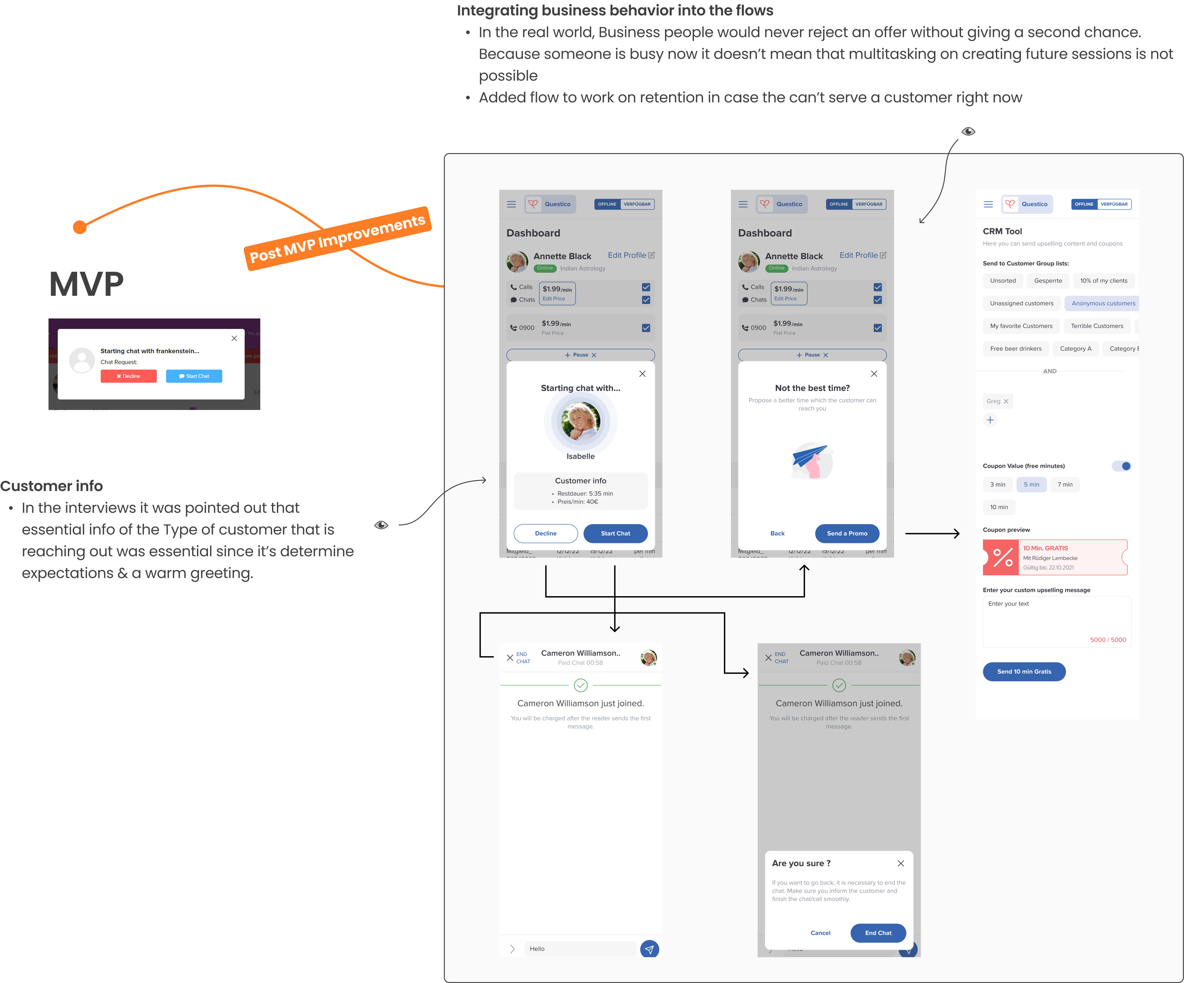
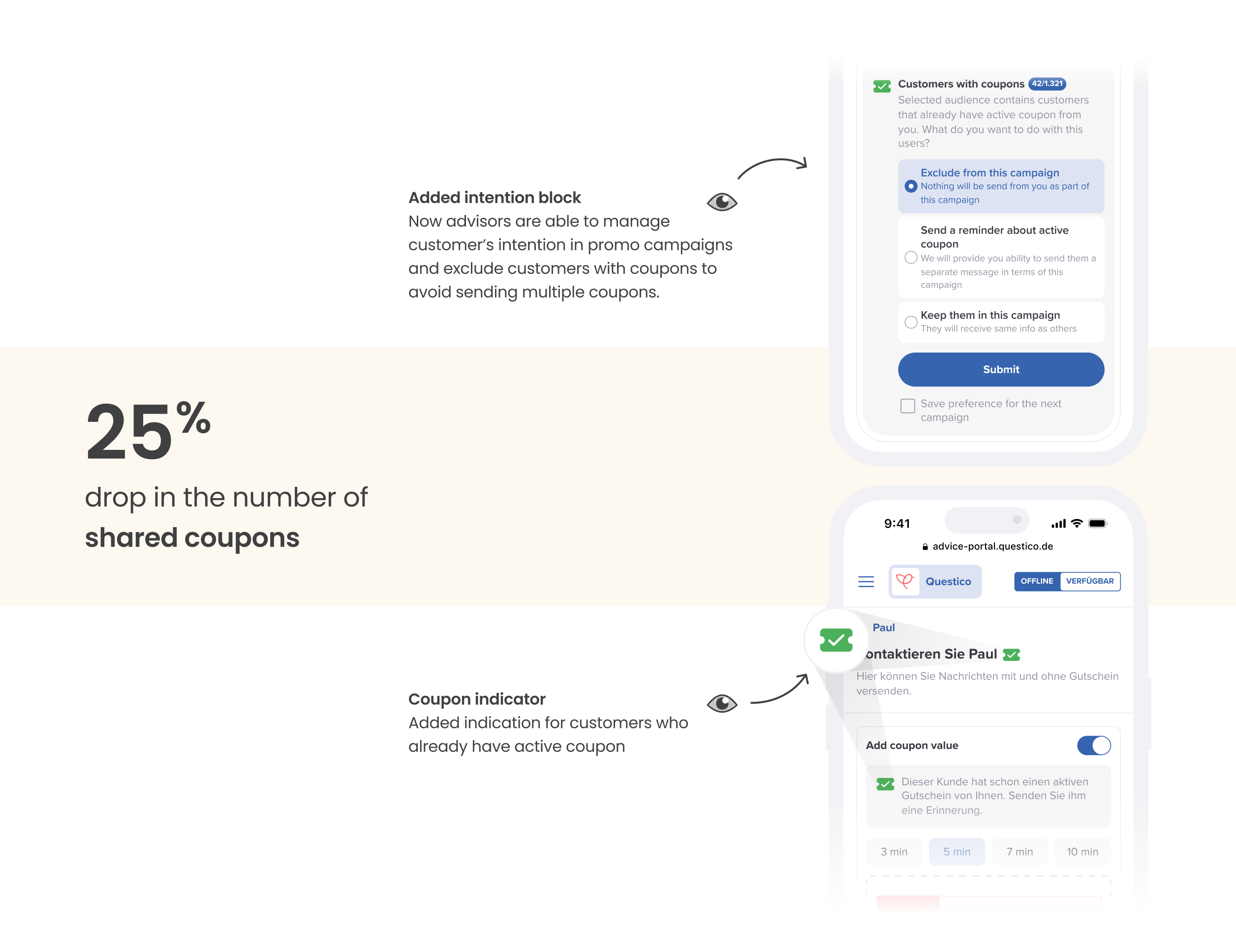
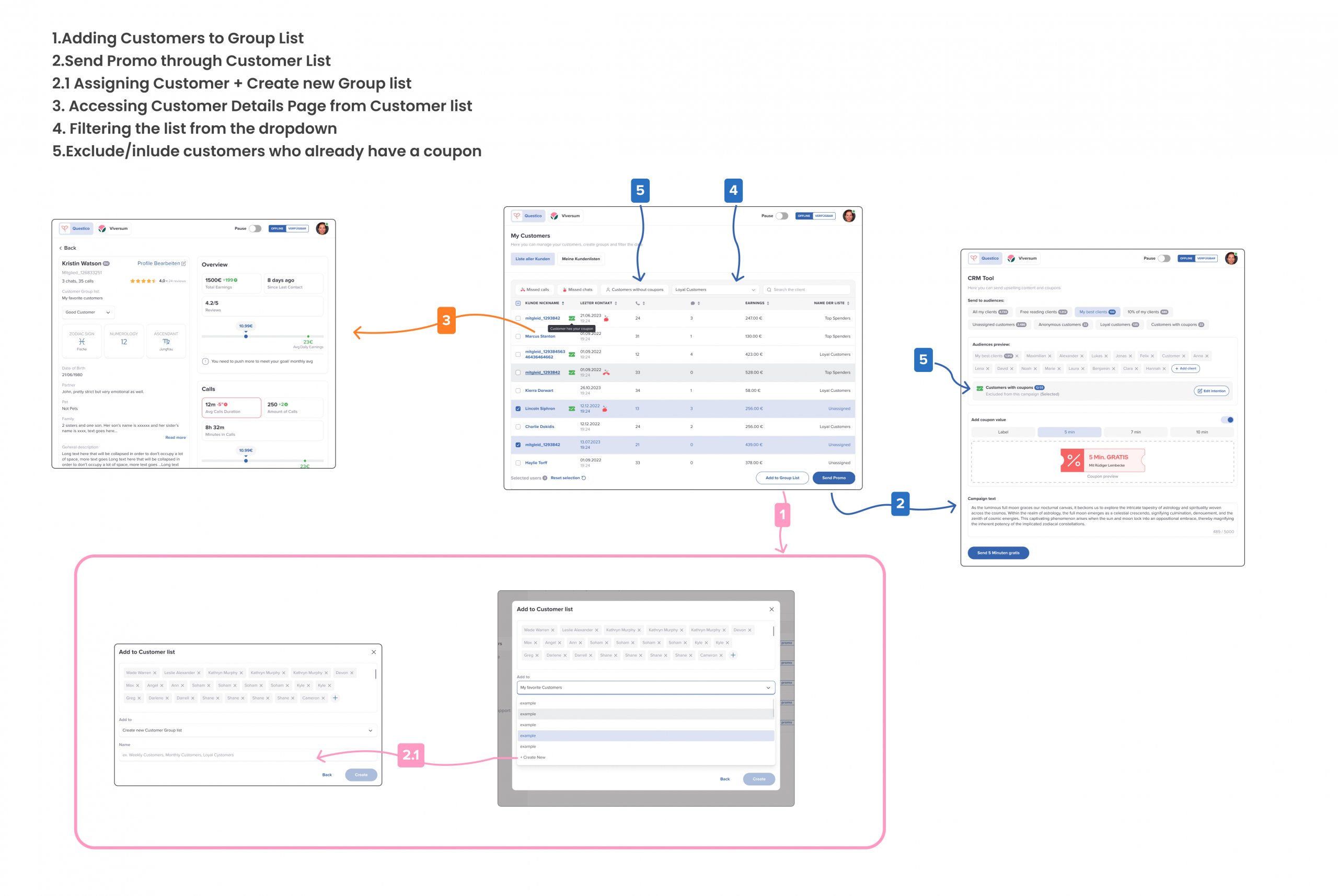
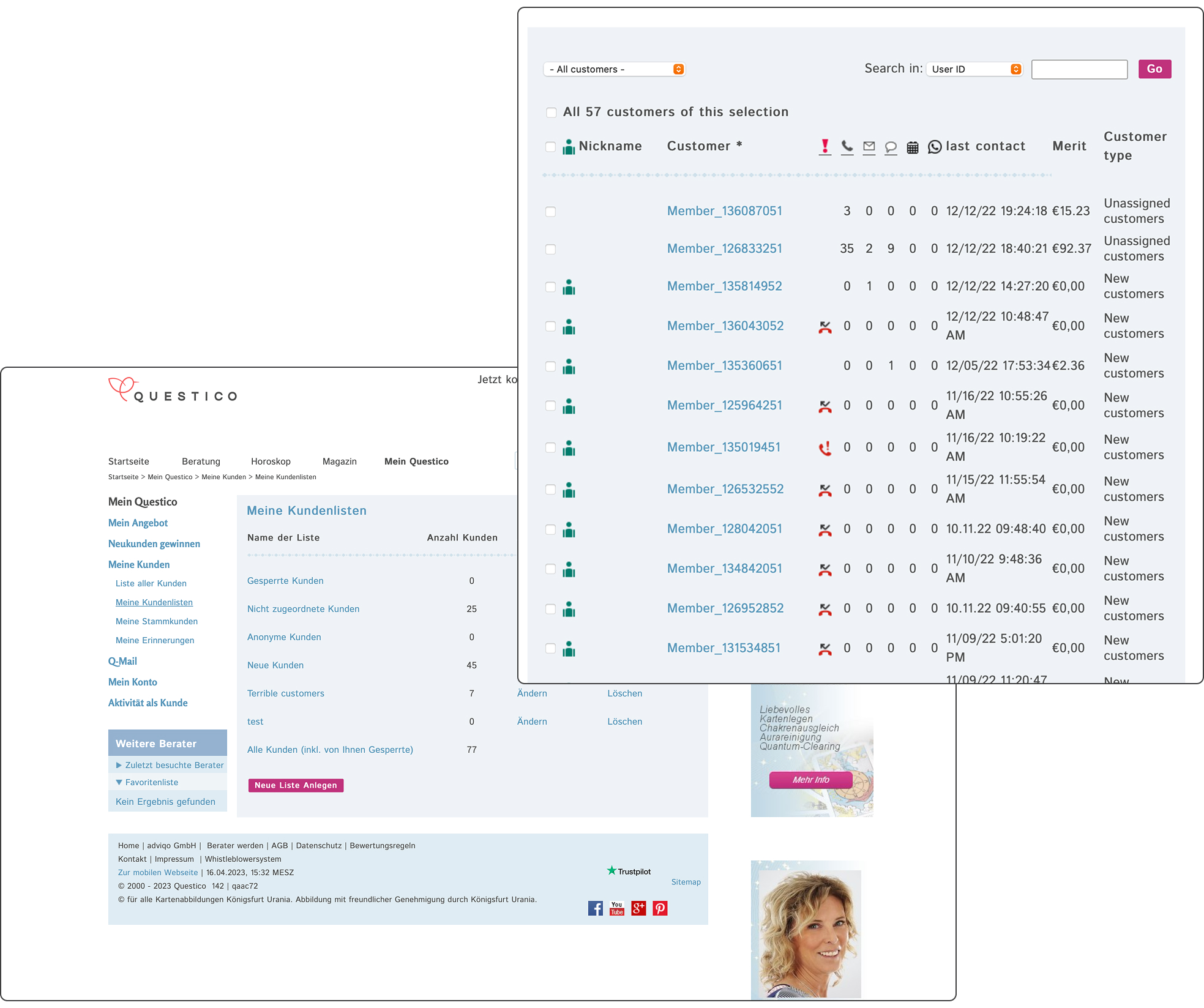
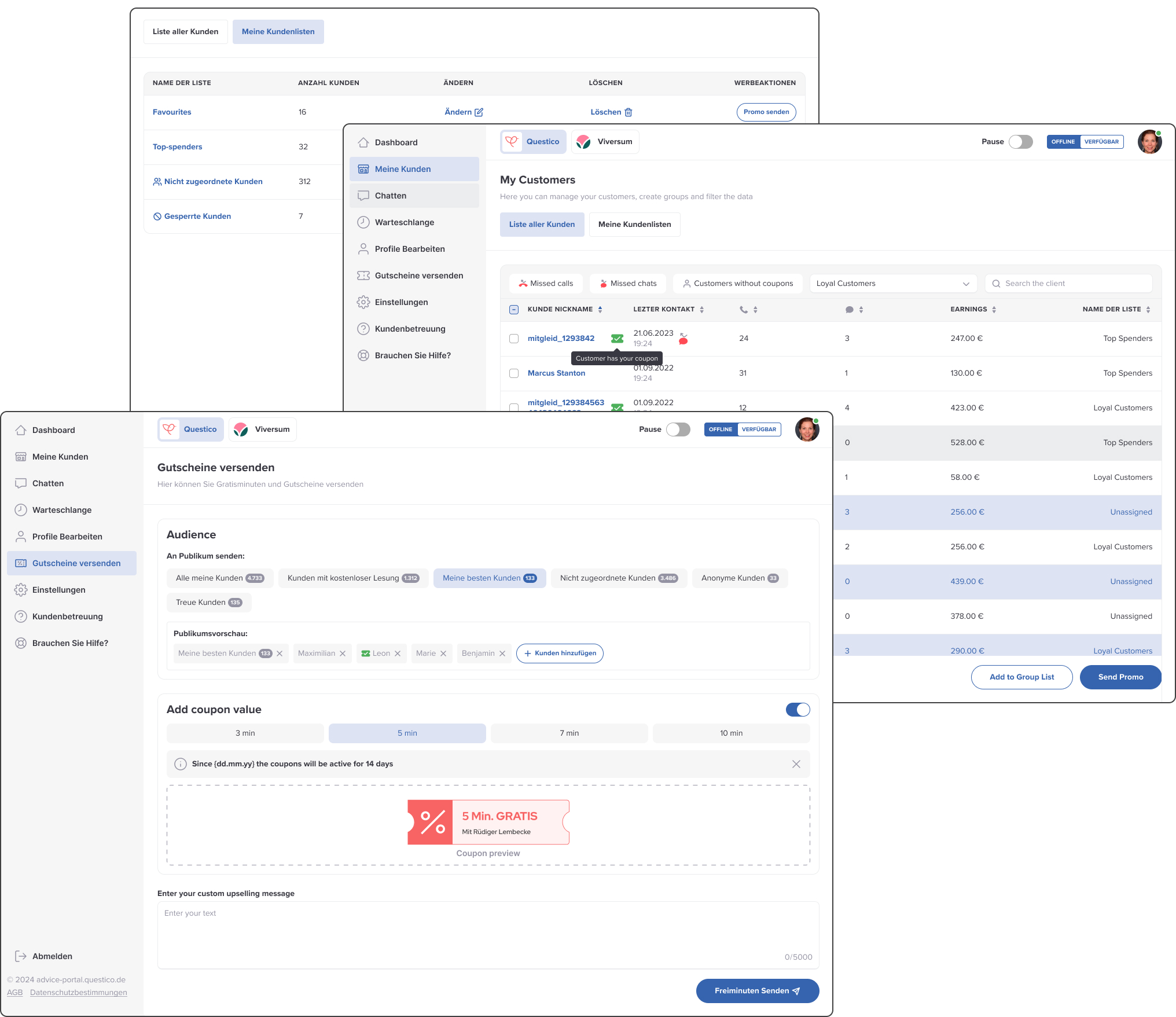
CRM Advisor Tool: Intent-Based Campaign Management
- Tailored campaign workflows per marketing objective
- Enhanced insights through customer data integration
- Improved coupon usage control mechanisms
Status Feature: Reflecting Advisor Availability
- Real-time status updates visible to customers
- Reduced missed interactions by improving transparency
- Improved coupon usage control mechanisms
