Checkout Screen Optimisation

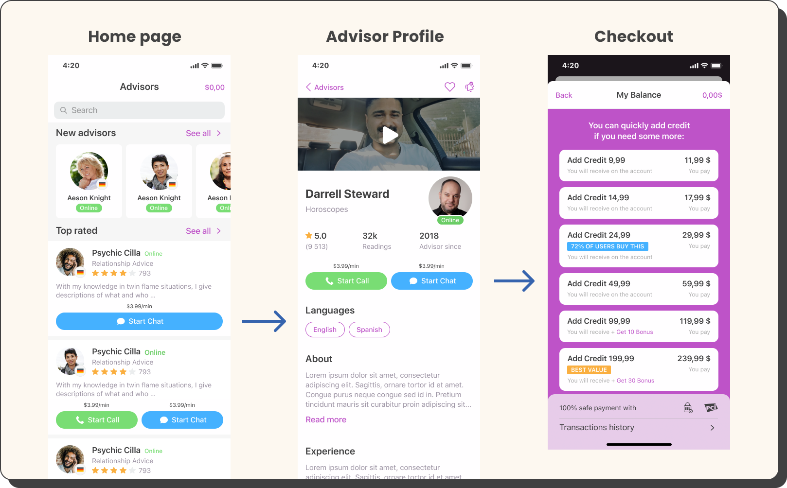
As Lead Product Designer for Zodiac, a white-label app and web platform serving English, Spanish, and Portuguese markets, I led the effort to optimize the checkout experience across Android, iOS, and web. Collaborating closely with the business owner and external development teams, I focused on improving transparency and trust during checkout, introducing upselling options, and running A/B tests to increase conversion rates and revenue. This involved redesigning payment screens, aligning UI across platforms, adding gamification and trust badges, and optimizing payment method options.

Task

The project required improving the checkout experience while balancing experimentation and risk, especially on iOS, which was the main revenue source. Key challenges included addressing inconsistent conversion rates across platforms due to differences in payment flows and coupon visibility. Designing a seamless and trustworthy checkout across mobile and web, optimizing payment methods, and using A/B testing to validate improvements took careful iteration and close attention to user behavior and technical constraints.

  • Strategy

    data-driven, A/B Testing

  • Design

    Product Design

  • Client

    adviqo

PRODUCT

Zodiac

Zodiac Psychics is the bench mark of a white label App & Web production which is being developed for English, Spanish and Portuguese speaking markets. Delivered for Android and iOS & Web this platform features variety of complex services across 3 different App & Web products, sharing the same code base.

The Role

Lead Product Designer

adviqo GmbH is a big company with many departments which sometimes make processes too long. For this reason, we had a small team (Startup like) within the company to drive some ideas a bit faster. In order to succeed that we are collaborating with 2 external agencies which provide 1 Back-End & Web team and one App team. I was working closely with the Business owner to coordinate our processes and roadmap.


More specifically in this case study, this was my personal project in which I didn’t involve other designers. I always enjoy making experiments and providing proof for my design proposals.

Vision

Goal 🎯

Improve Checkout in Apps & Website

  • improve transparency & trust
  • add upselling options
  • A/B test different designs to increase checkout rates
iOS | Android | Website

Payment screens | Before

OLD SCREEN

Website

OLD SCREEN

iOS

OLD SCREEN

Website

Research

R&A

Understand current metrics and try to improve them

  • Overall conversion rate 
  • Upsell packages
  • Convert new users
  • Conversion from free to paid users

Main problems

  • too many users using welcome offers/coupons
  • not many users are converting to paid users
App | Converting free to paid users
0%
Website | Converting free to paid users
0%

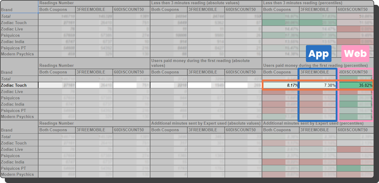
Website is clearly leading this metric

Why?

  • Higher discount on Website
  • We are displaying the discount in the Payment screen VS in the Apps that the coupon is displayed only on the screen before
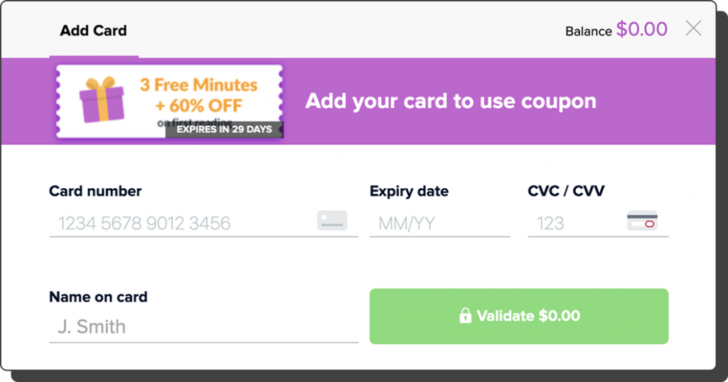
  • It’s required to add Credit Card before using the free coupon VS the app
Research

R&A Conclusions

Next Steps | App & Website

  • Optimize the payment screens further
  • UI improvements
  • Add offers, when applied, in the whole flow until the final step of the payment flows(we have many)
  • A/B test Gamification elements
  • Add Trust badges
  • Apply what works on the website, into to the app
android only

A/B Test no.1

Actions

  • Adding trust badges
  • Adding gamification elements
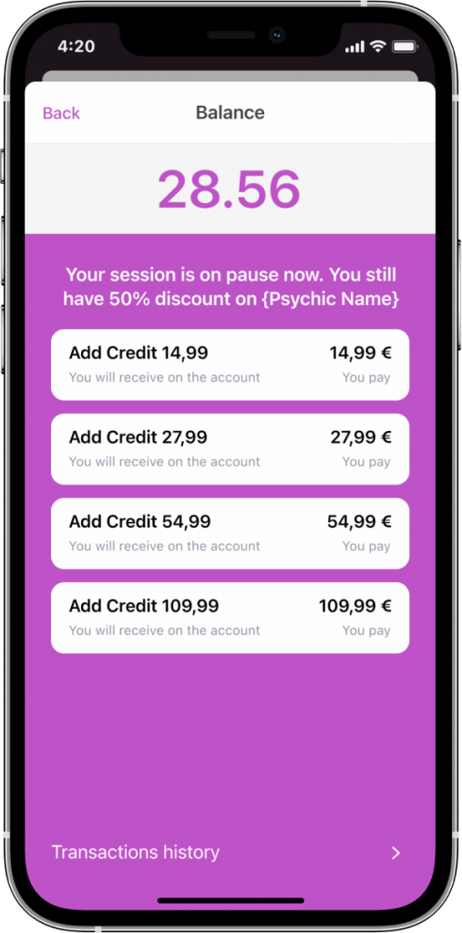
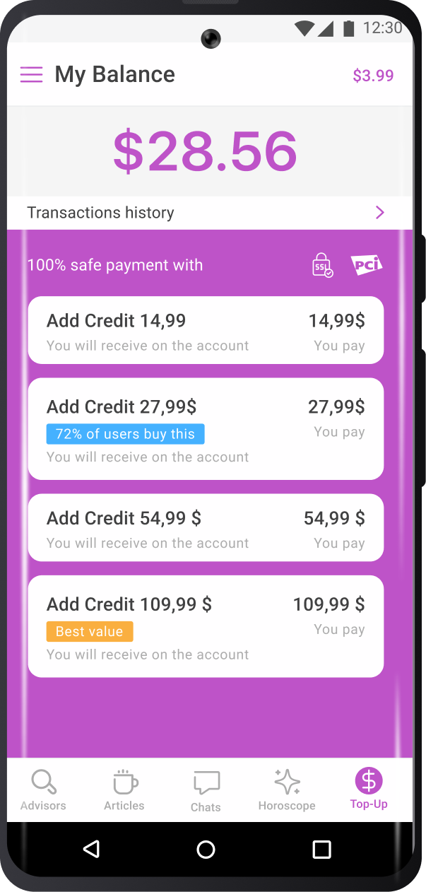
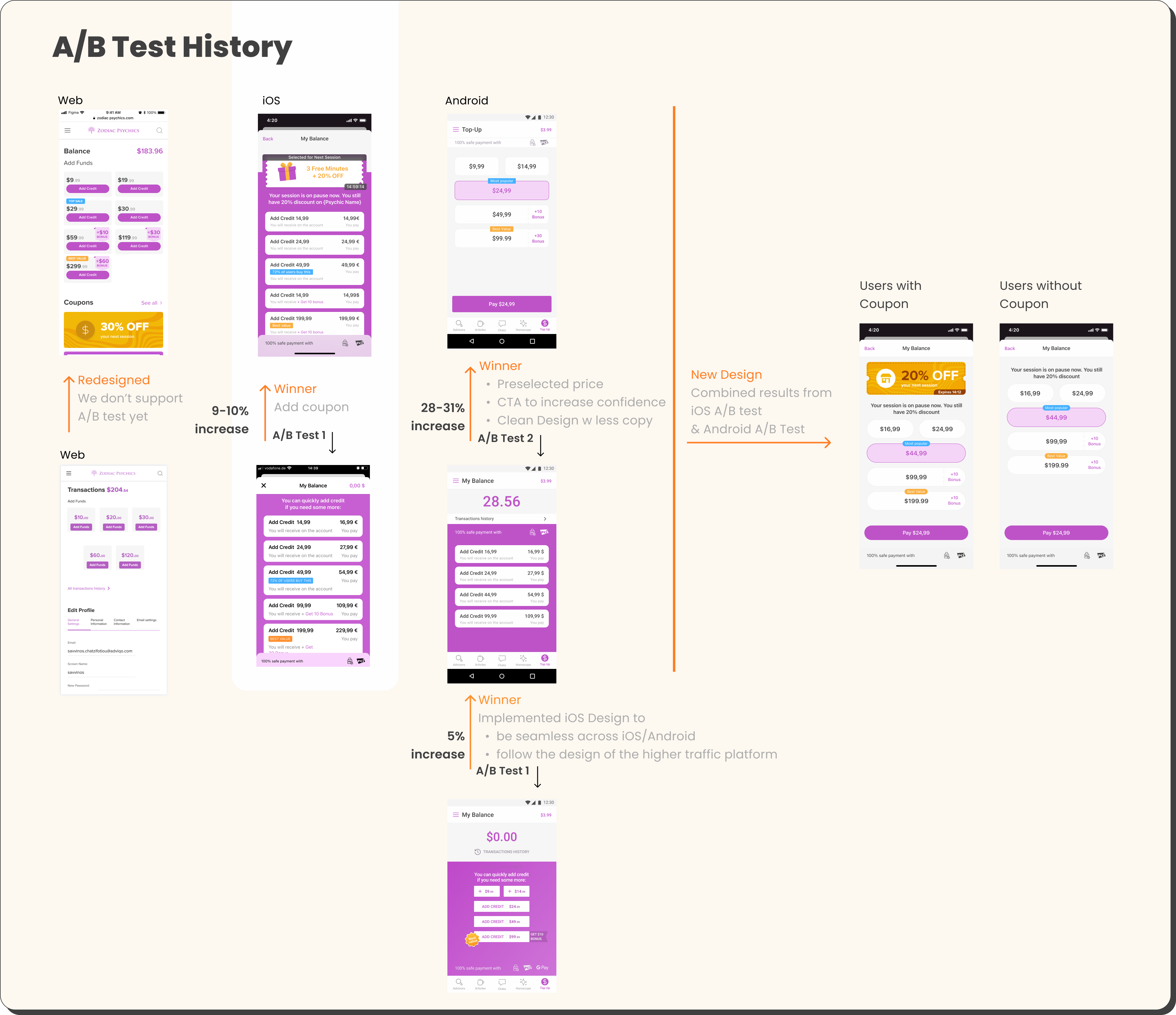
  • Align Android and iOS Topup screens. Revenue in iOS is much higher so I chose to implement the same screen in Android as well
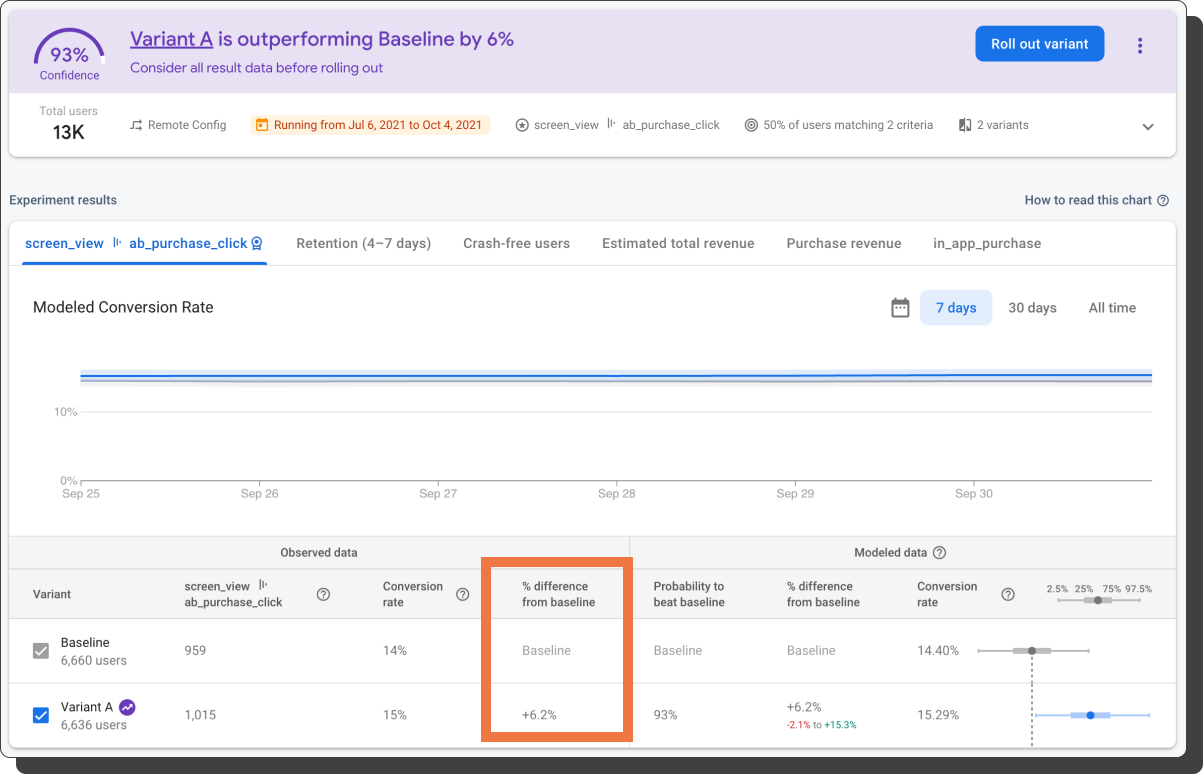
Increased Revenue on Android by 6%
0%
Before After
iOS only

A/B Test no.2

Actions

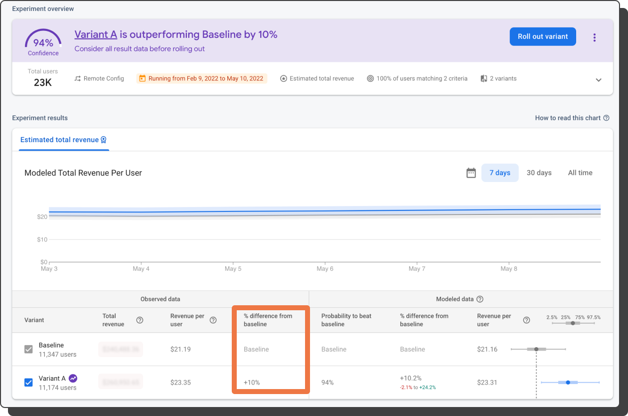
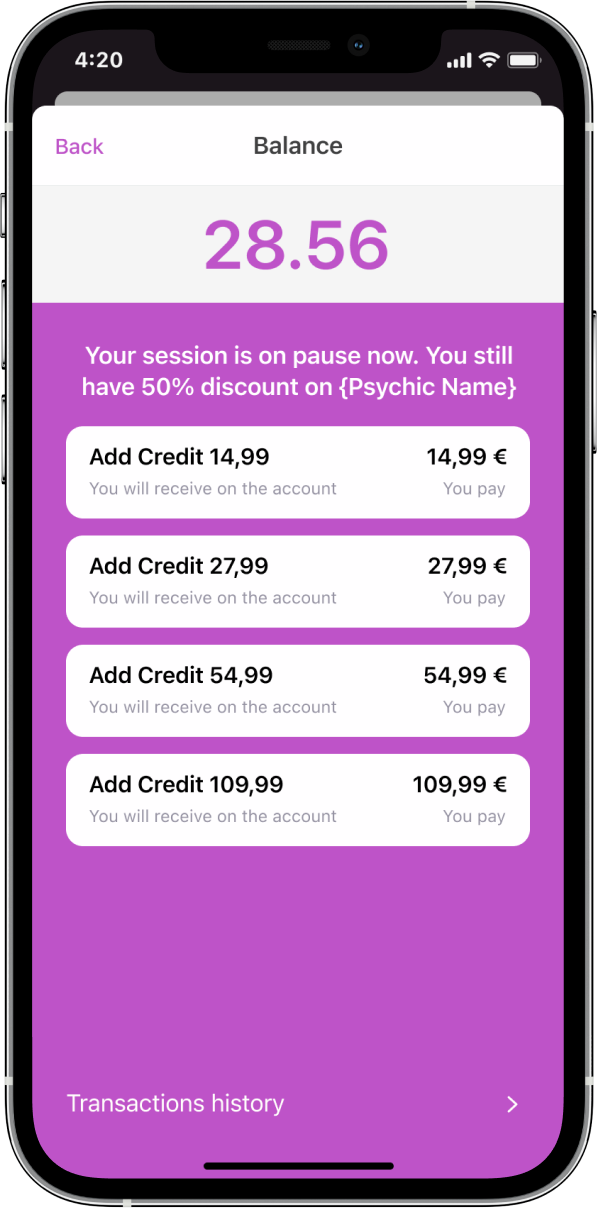
  • Display applied coupon to the payment screen after the Website’s implementation which has a better performance in converting new users
  • iOS is Zodiac’s main source of revenue therefore I am more careful with the experiments which I am taking one step at a time to increase certainty 
Increased Revenue on Android by 10%
0%
Before After
android only

A/B Test no.3

Actions

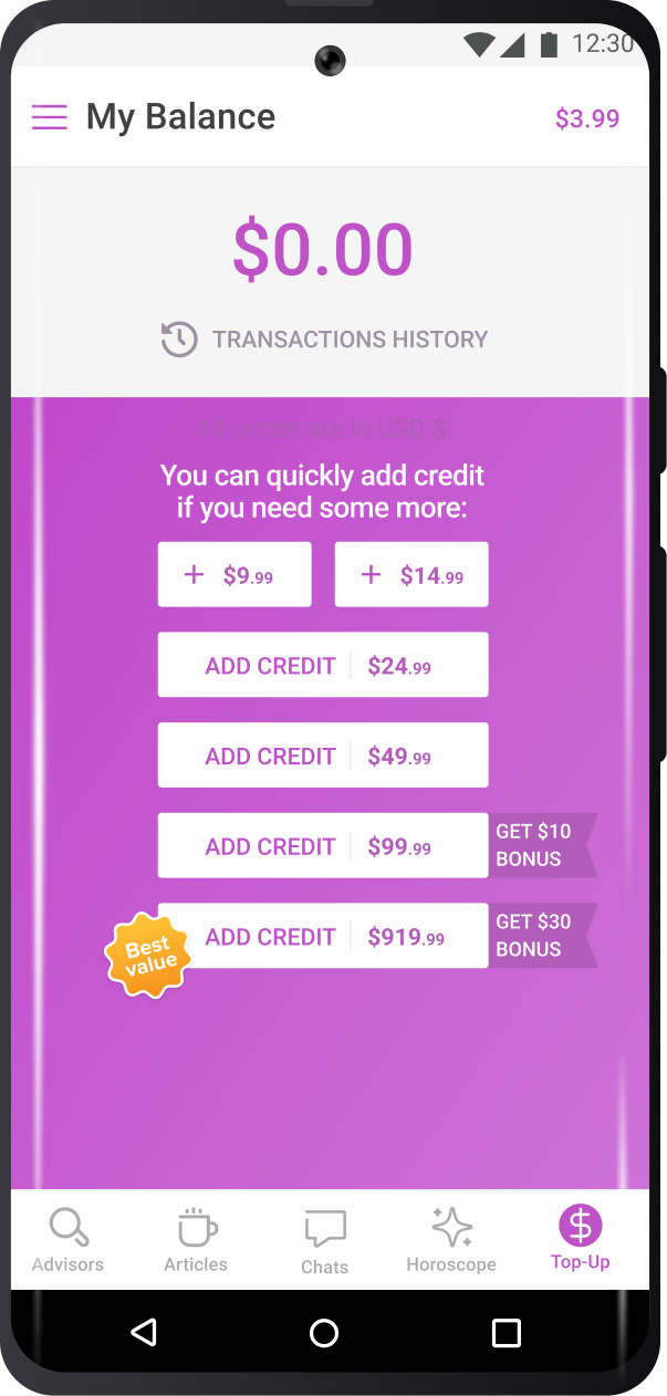
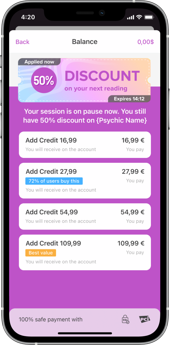
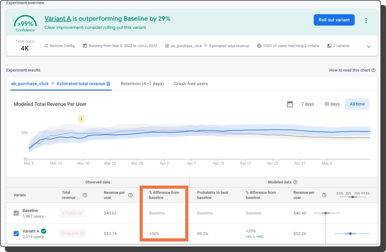
  • Display applied coupon after implementing a similar experiment to iOS and increasing the revenue to 10%
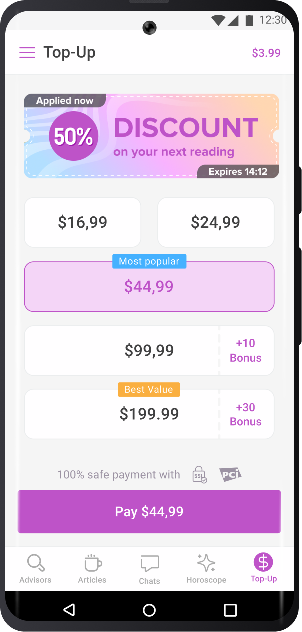
  • I could experiment more with the Android app since the revenue coming from that platform is significantly smaller. That’s why I chose to try “bigger” changes. 
  • Made 2 cheapest top-up options smaller to attract less attention
  • Added preselection top-up option in order for the users to top up with 1 click
  • Added CTA that displays the exact amount the user will pay to decrease the uncertainty of the amount they will pay
Increased Revenue on Android by 30%
0%
Before After
History

Overview

Web only

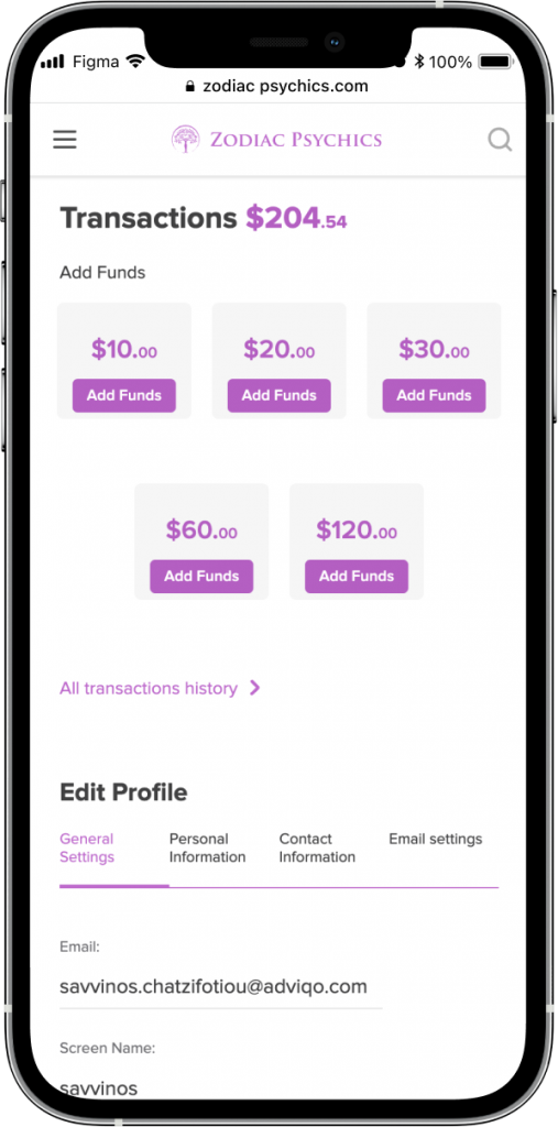
Website improvements

Unfortunately, we can’t conduct A/B test experiments on the website because we don’t support it yet

Actions

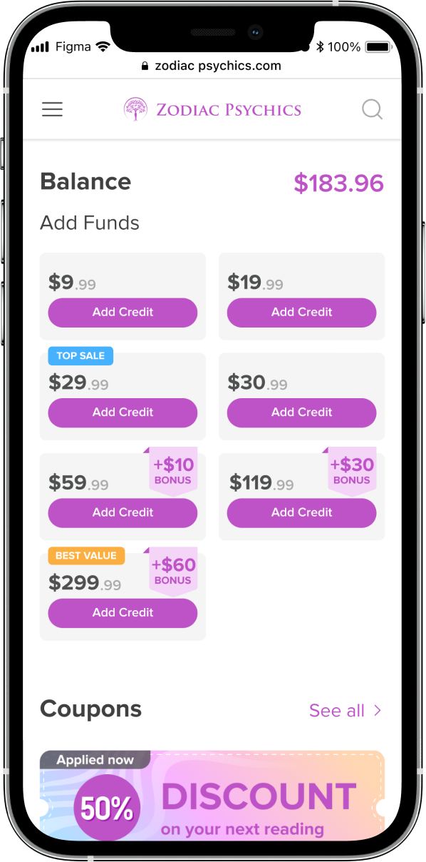
  • Reflect the changes/ success if the App A/B tests to the Website
  • Aligned the topup options across our platforms.
  • Added Bonuses to the biggest tiers
  • Added gamification stickers
  • General UI fixes
  • Added coupon section below the top-up screen
  • Moved the transactions’ history to the bottom of this page since I know from GA that after each call they are checking this info. Therefore I wanted the users to scroll through what we wanted before reaching their non-conversion goal
Before After
WEB

change dashboard and payment screen

Actions

  • UI improvements
  • adding payment methods
  • dashboard. add bonus and gamification stickers, full screen to avoid distraction
  • disable the input field while topping up
android only

Add Payment methods

Actions

  • Talk about custom vs Adyen
  • Apple pay, CC, Paypal to stay away for IAP
  • Try to add coupons specific to payment methods to motivate users to not use iap etc
  • new users adding cc before using welcome offer
  • whales paying with cc to use coupon
Back